Client
The Fixer
SERVICES
Brand Strategy | Identity | Touchpoints | Stationery
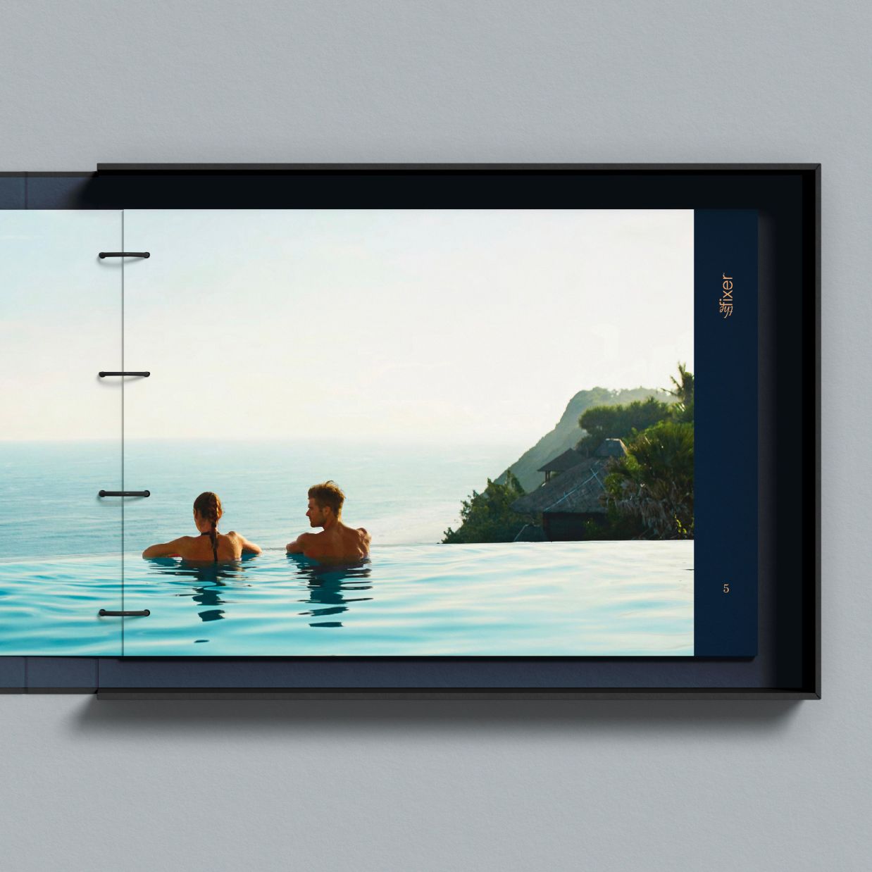
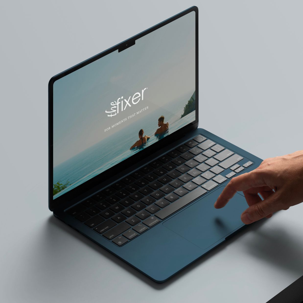
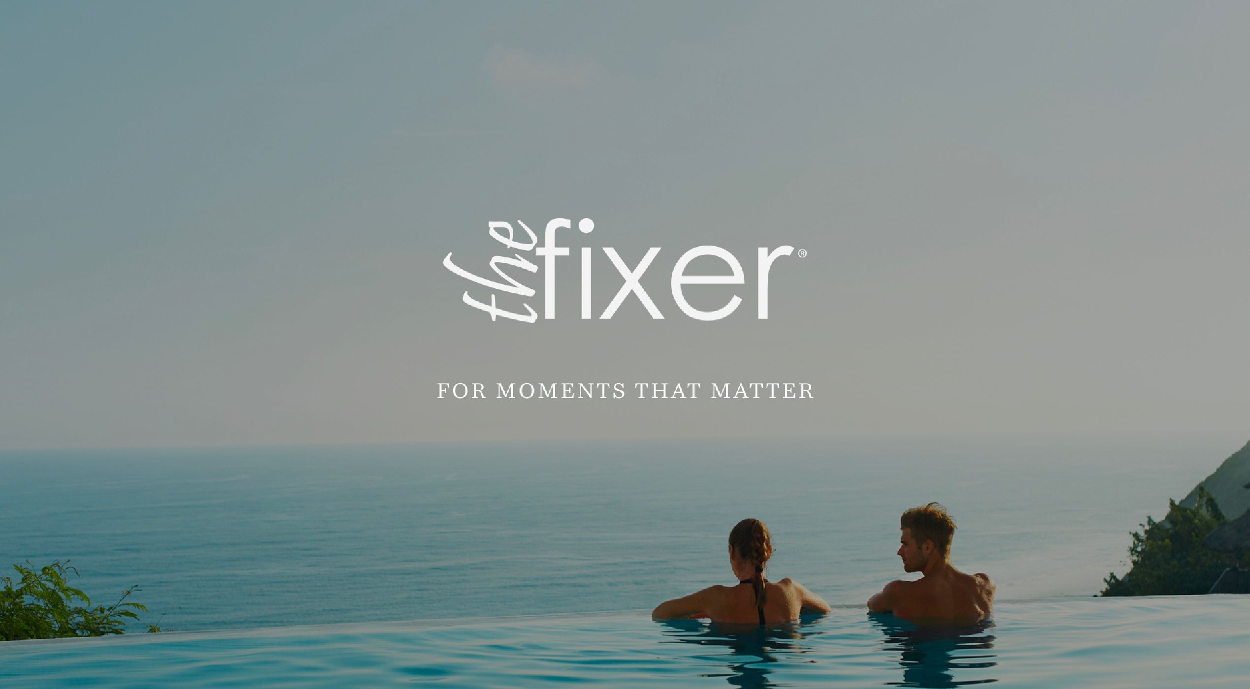
The Fixer is a UK-based luxury lifestyle and experiential travel company that curates extraordinary
moments for HNWIs and UHNWIs. From private escapes to once-in-a-lifetime events, every
experience is crafted with discretion, care, and a deep sense of excellence.


MORE THAN SERVICE — A SIGNATURE that
BUILDS A BRAND, TURNING MOMENTS into
MASTERPIECES for the GLOBAL ELITE.
The Fixer is a UK-based luxury lifestyle and experiential travel company serving a global client
of HNWIs and UHNWIs. We crafted a brand narrative centered on precision, sophistication, and
passion, positioning The Fixer as a trusted partner in curating unforgettable experiences — from
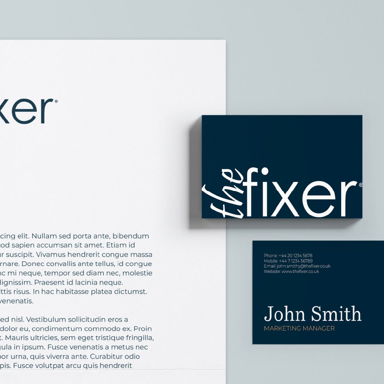
private escapes to high-profile events. The visual identity pairs a bold sans-serif logo with delicate
cursive, blending strength with intimacy.
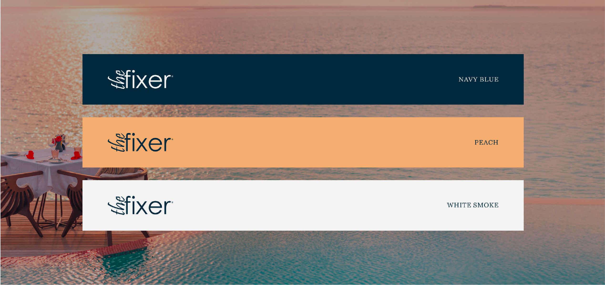
A palette of navy blue, peach, and white smoke offers a balance of authority and warmth, while
the typography system conveys clarity and refinement. With a tone of voice rooted in opulence and
authenticity, every message reflects care and discretion. From website to stationery and digital
touchpoints, every detail was designed to express timeless elegance and lasting emotional impact.
TYPOGRAPHY


FONTS GUIDE
HEADING
Sub-heading
The Fixer typography combines a classic serif with a refined sans-serif, striking a balance between tradition and modernity. The serif brings authority, sophistication, and timeless elegance, while the sans-serif adds clarity, approachability, and contemporary style. Together, they create a visual identity that is confident, versatile, and distinctly memorable.