Client
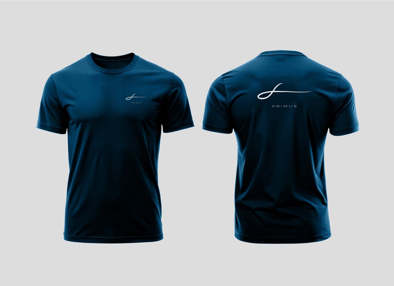
Primus
SERVICES
Branding Strategy | Brand Identity | Branding Touchpoints
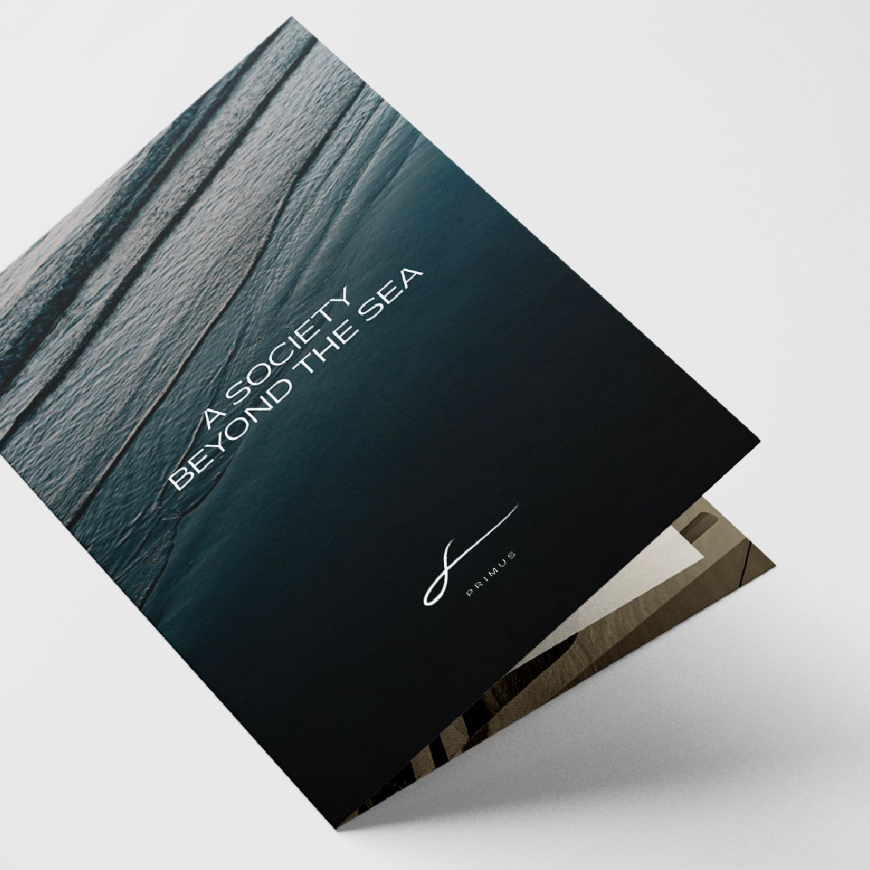
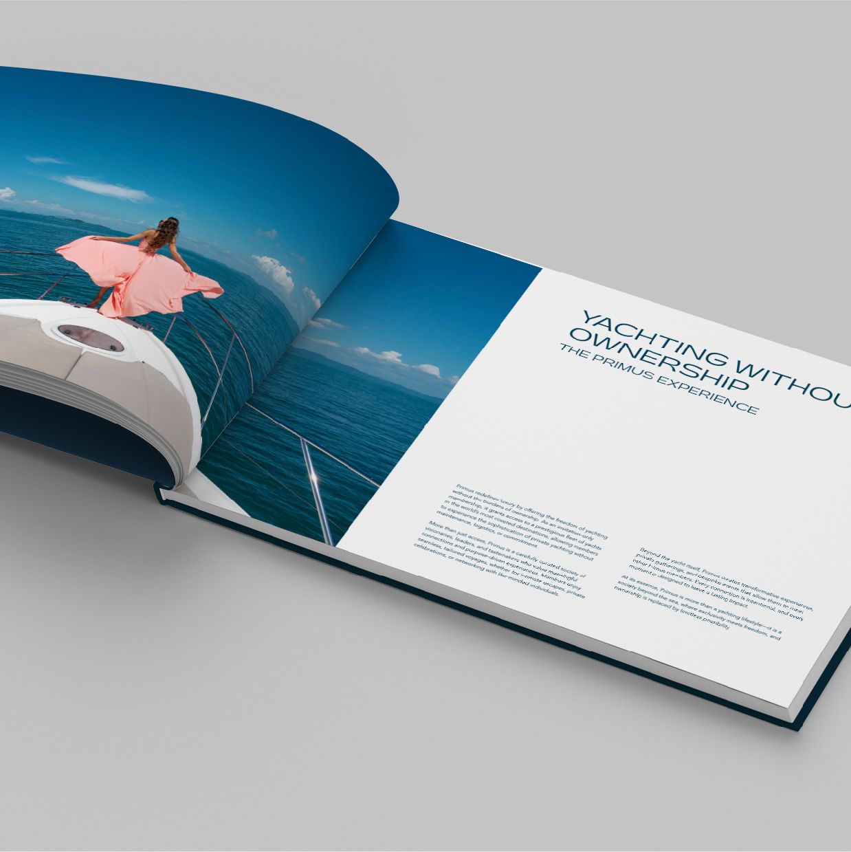
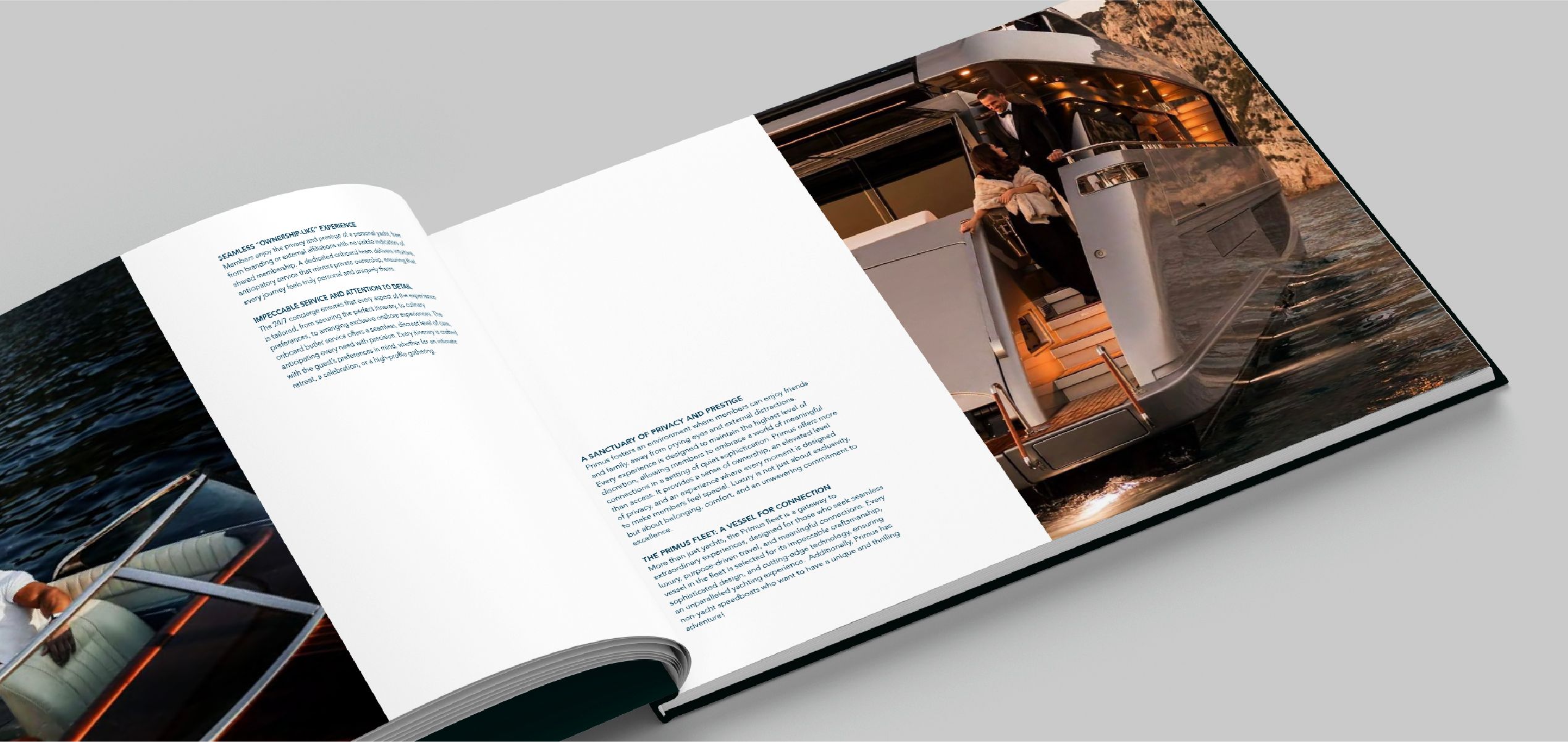
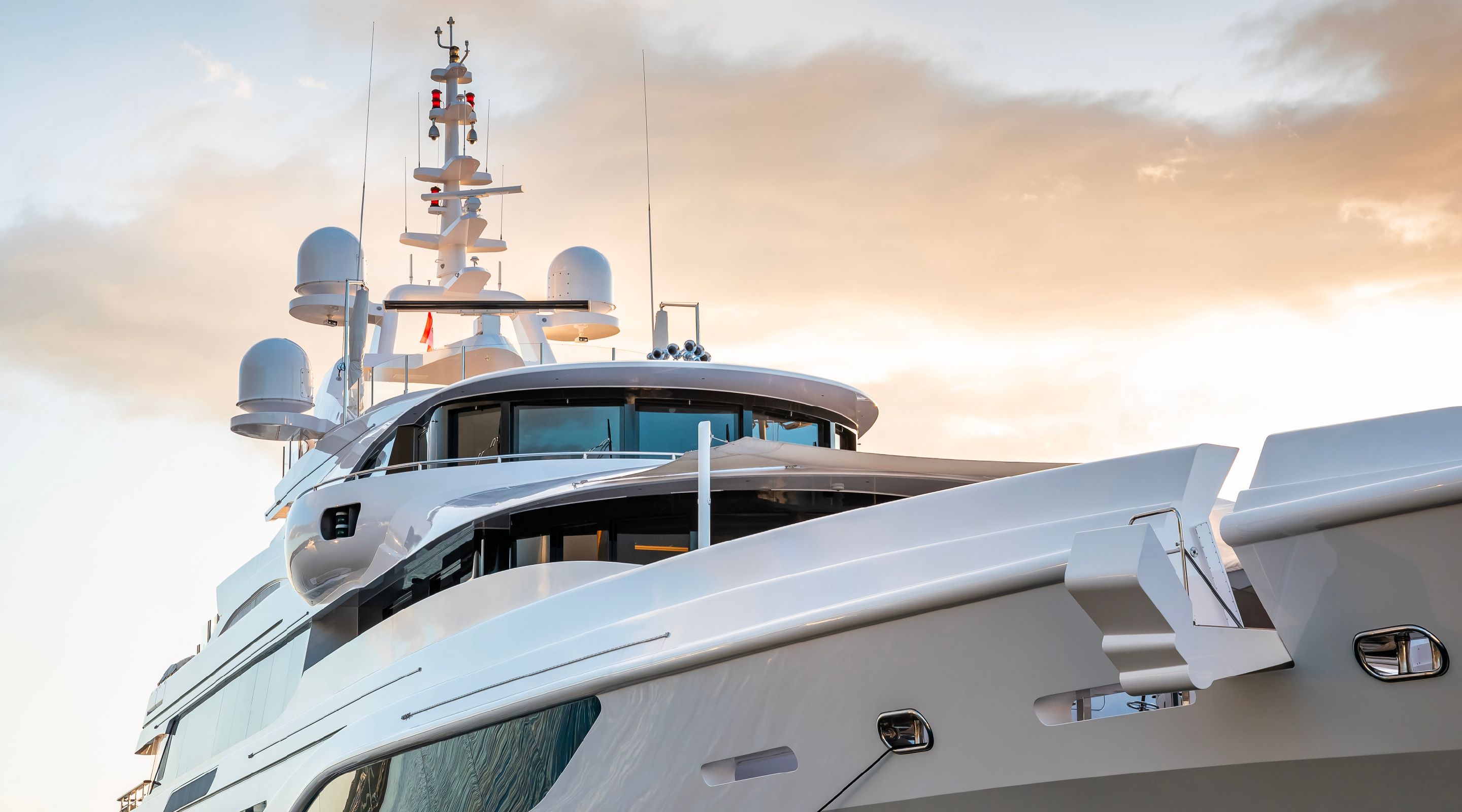
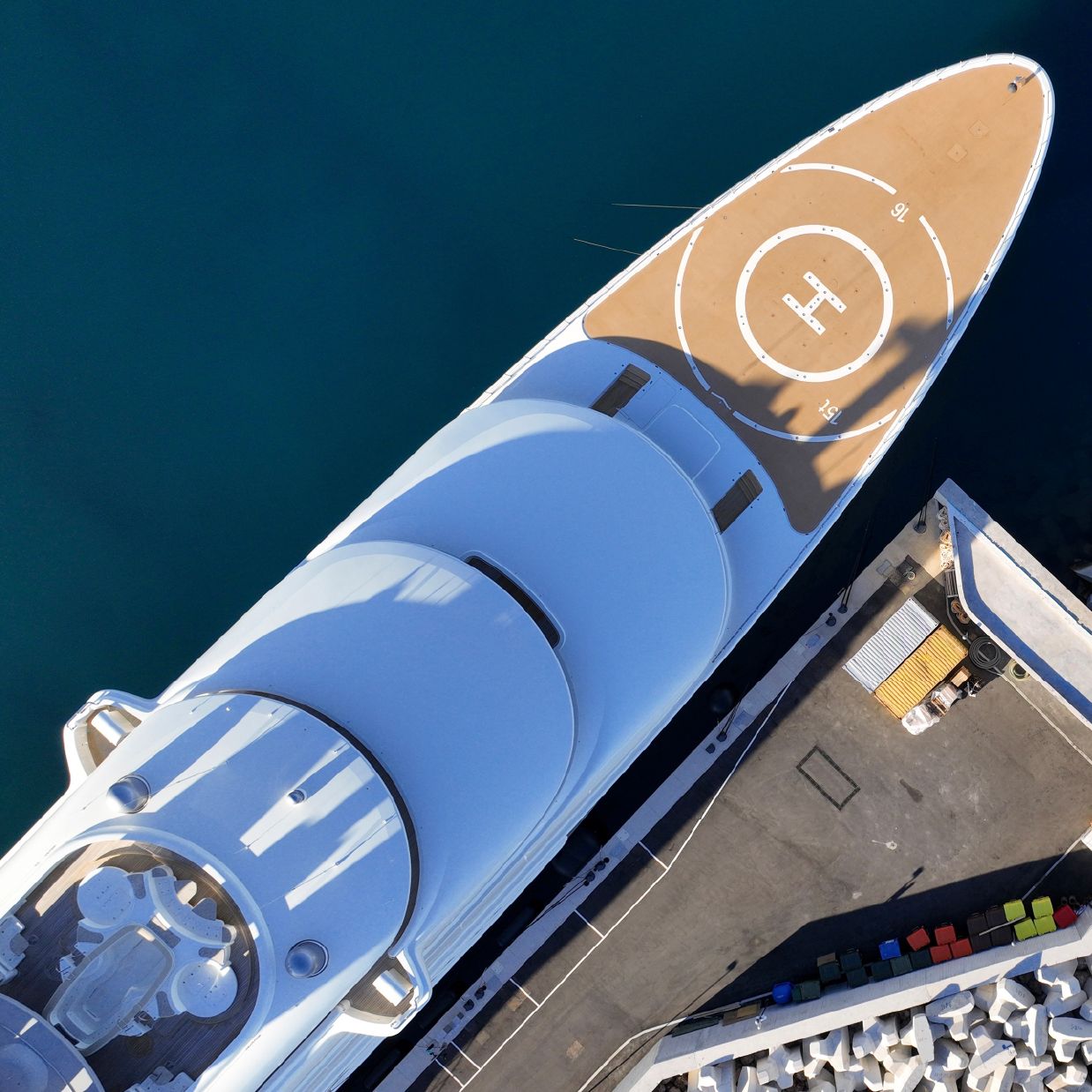
Primus is a private yachting society reserved for global visionaries seeking more than ownership.
With seamless access to a worldwide fleet, it offers a lifestyle of curated freedom, intentional
connection, and elevated experiences shaped by discretion, craftsmanship, and deep personal meaning.


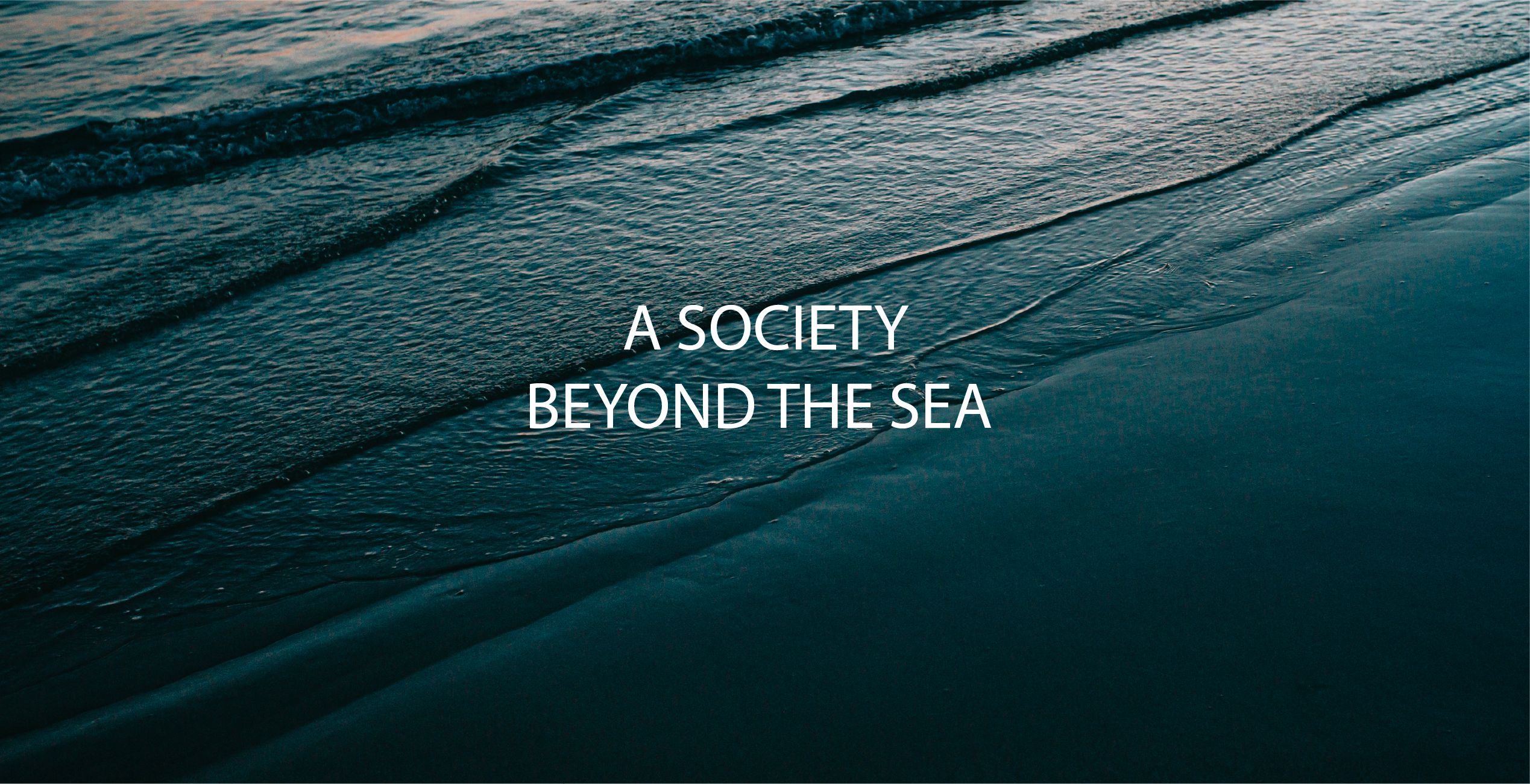
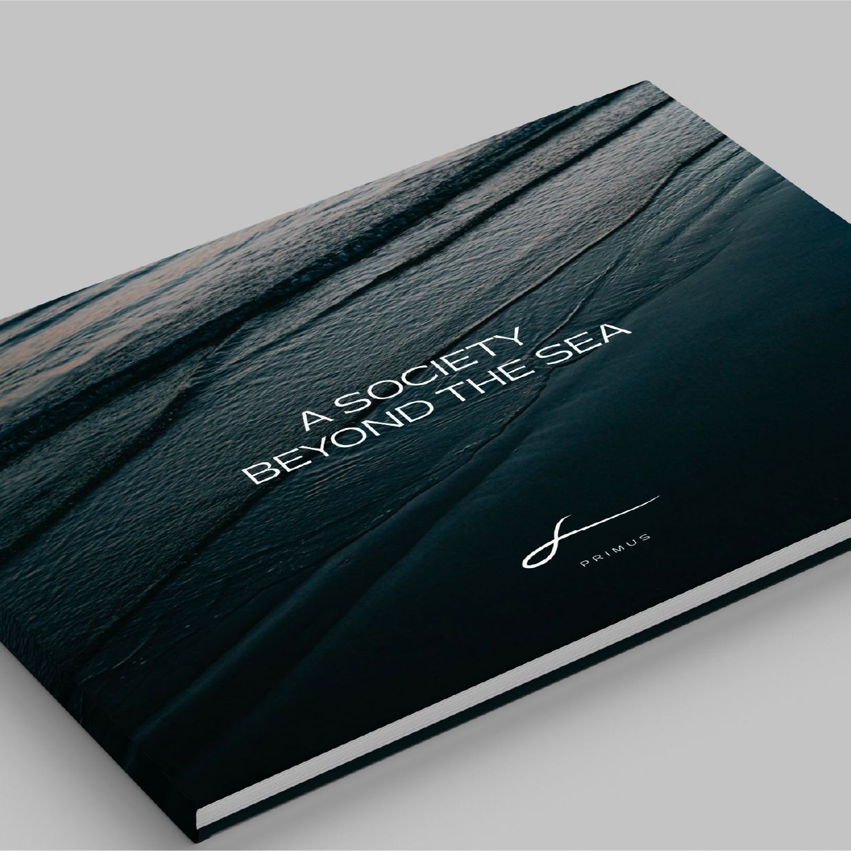
THE ELEGANCE of INVITATION-ONLY LIVING
DEFINES AN IDENTITY THAT FLOWS with
PRESTIGE, CALM, AND CONTROL
Primus is an invitation-only yachting society that redefines luxury through access without
ownership, offering a lifestyle shaped by freedom, discretion, and purpose. We developed the
full brand strategy and identity to reflect intentional living and elevated connection. Inspired
by the quiet power of the sea, the visual world uses deep ocean blues, forest greens, and elegant
neutrals, with textures that suggest calm and fluidity.
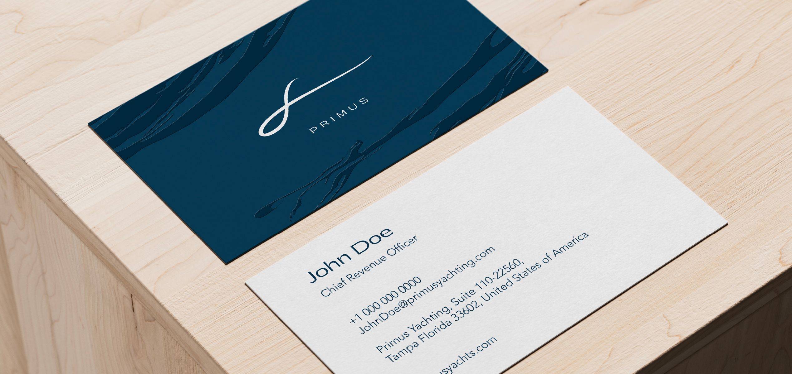
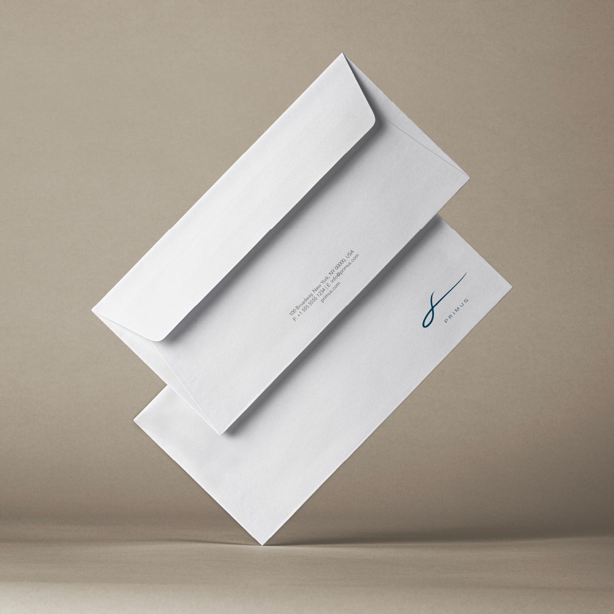
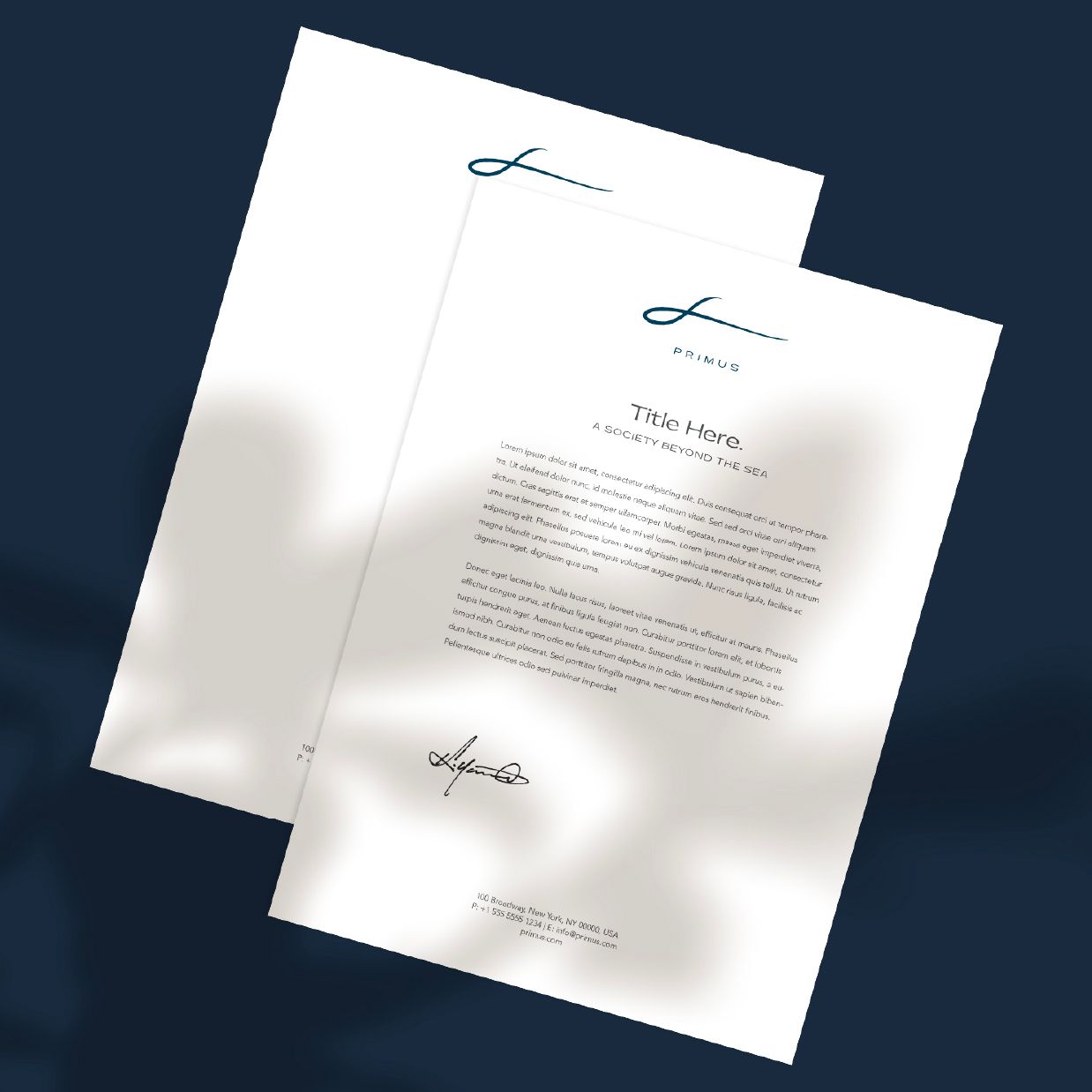
Typography pairs classical precision with modern restraint, creating a tone of subtle prestige. Every
detail — from embossed stationery to a velvet membership box with matte gold accents — was crafted
to express care and distinction. Primus is more than a brand; it is a universe where influence is
quiet, journeys are personal, and membership holds true meaning.


TYPOGRAPHY


FONTS GUIDE
HEADING
Sub-heading
Primus Typography blends a timeless serif with a refined sans-serif, striking a balance between tradition and modernity.
This pairing is designed to convey elegance, clarity, and quiet authority, ensuring communication feels both confident and
understated. The system embodies a world of discretion, intention, and modern sophistication, allowing it to adapt
seamlessly across applications—from formal editorial layouts to contemporary digital interfaces.