Client
Elemental 22 & 78 by Elemental
SERVICES
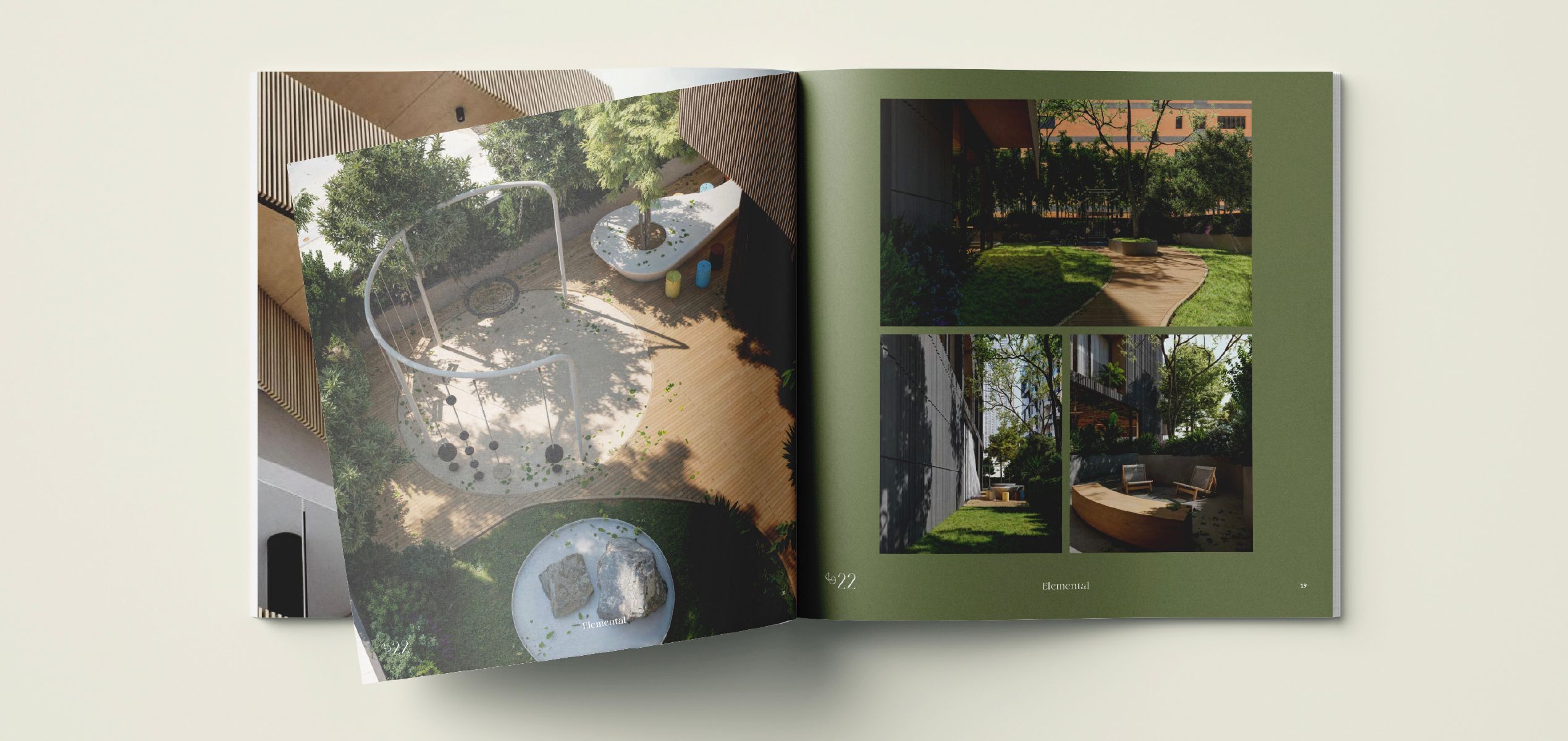
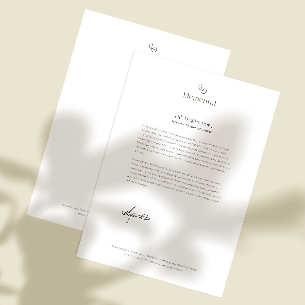
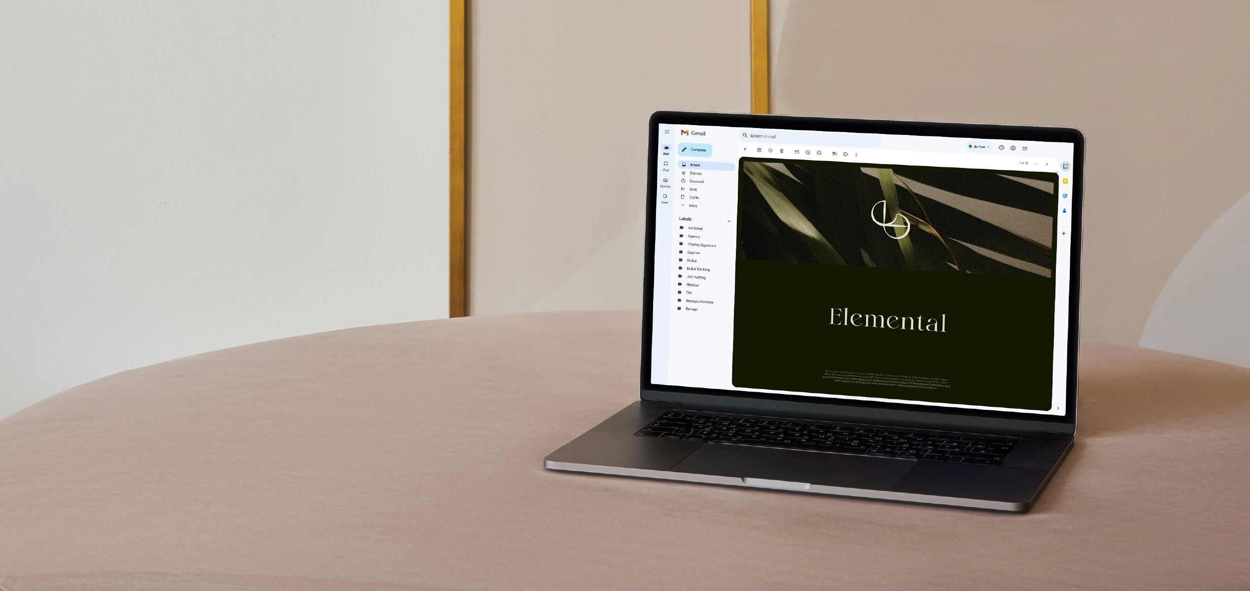
Brand Identity | Branding Touchpoints
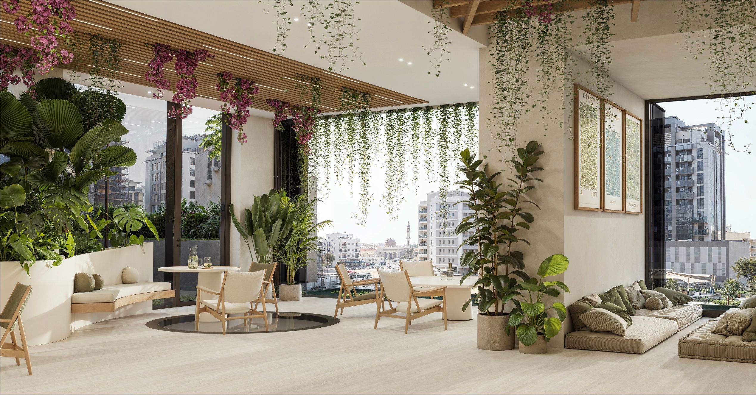
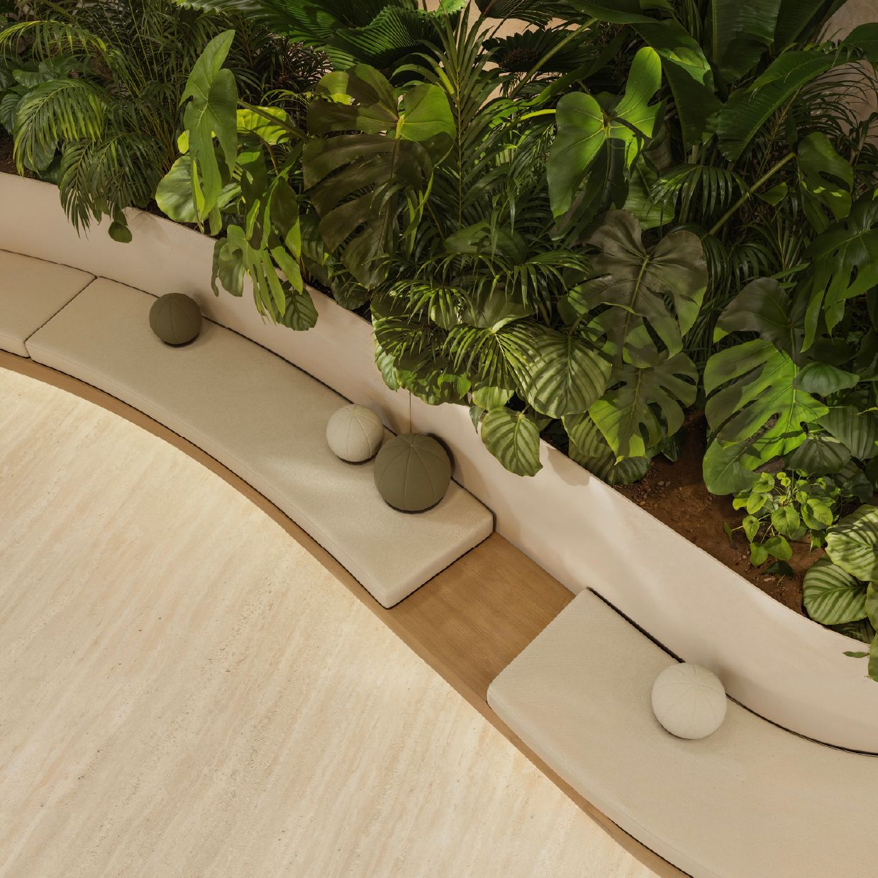
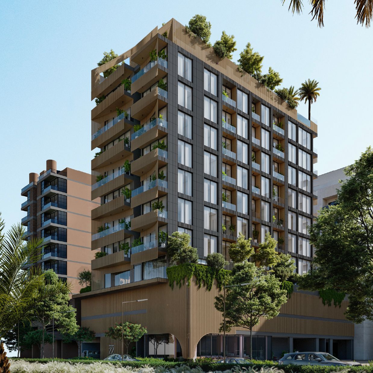
Element 22 & 78 is a visionary residential brand that merges nature with architectural elegance.
Designed for those who seek refined, tranquil living in urban settings, it orders serene environments
rooted in wellness, sustainability, and contemporary design excellence.

LUXURY LIVING NATURALLY REDEFINED through A
BRAND THAT HARMONIZES DESIGN, WELLNESS,
and URBAN SERENITY.
Element 22 & 78 is a residential brand that reimagines urban living through the lens of nature, calm,
and design integrity. We developed the brand identity to express a lifestyle rooted in balance and
sophistication. The visual system features a palette of soft neutrals, moss greens, and graphite tones,
paired with clean, modern typography to evoke tranquility and elegance.
The logo, inspired by elemental structures and atomic bonds, symbolizes connection, fluidity, and
timeless form. Every touchpoint—from collaterals and digital platforms to social media—was crafted
to feel understated, refined, and grounded in meaning. More than a place to live, Element 22 & 78
invites residents into a world shaped by wellness, architectural clarity, and a deep connection to nature.

TYPOGRAPHY


FONTS GUIDE
HEADING
Sub-heading
The Bigilla typeface brings refined elegance and calm sophistication to the logo, echoing the project’s serene, nature-inspired setting. Its soft curves and classic details reflect a bespoke, design-led lifestyle—balancing modernity with timeless charm. Bigilla embodies the development’s identity: elegant, natural, and thoughtfully crafted for elevated residential living.