Client
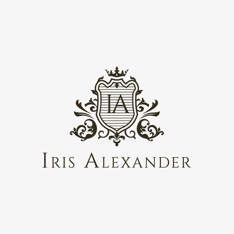
Iris Alexander
SERVICES
Brand Strategy | Brand Identity | Art Direction | Verbal Identity | Branding Touchpoints
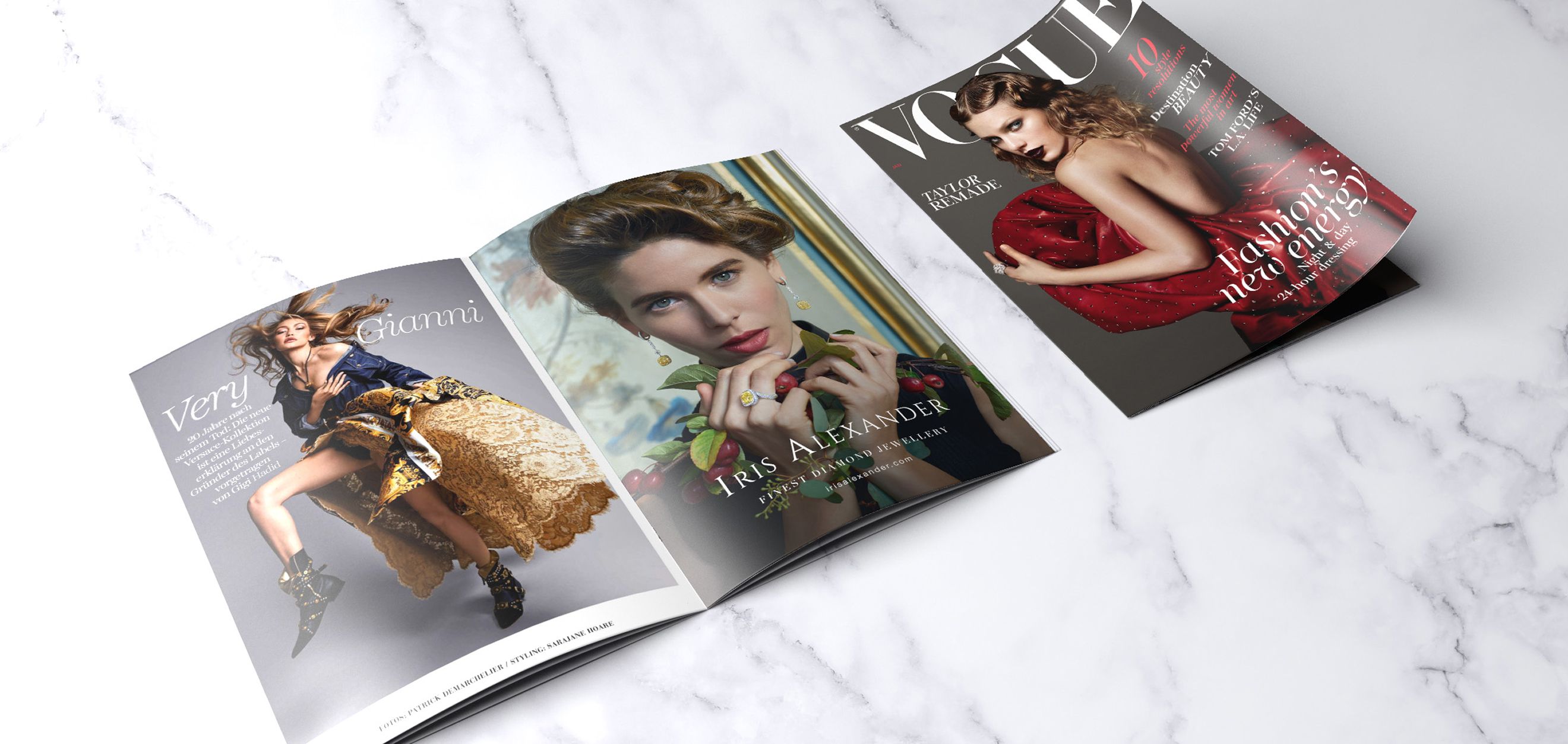
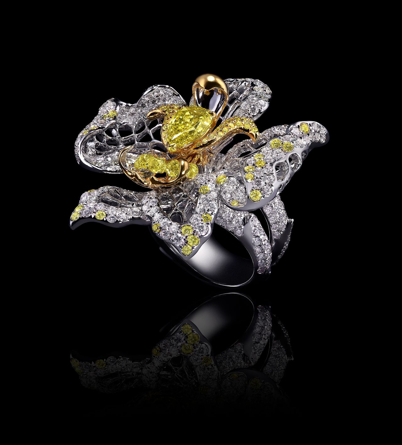
Based in Hong Kong, Iris Alexander is a fine jewelry house where Renaissance grandeur meets contemporary power. Each piece is a bold expression of identity, designed for women who lead with strength, confidence, and a desire to wear their story with pride.

THE ART of UNAPOLOGETIC ELEGANCE :
CRAFTING A JEWELRY IDENTITY THAT
CELEBRATES CONTROL, CHARACTER, and CRAFT.
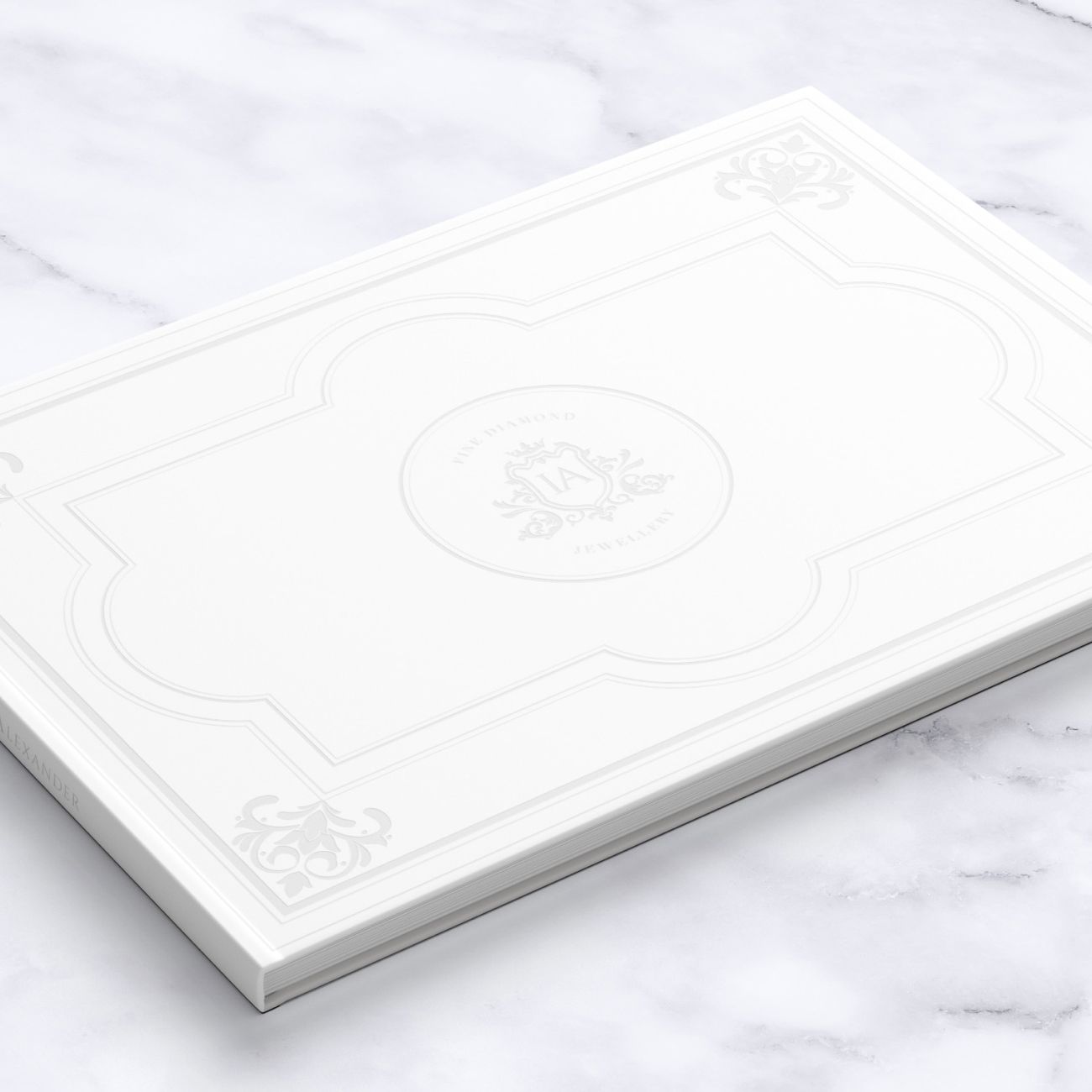
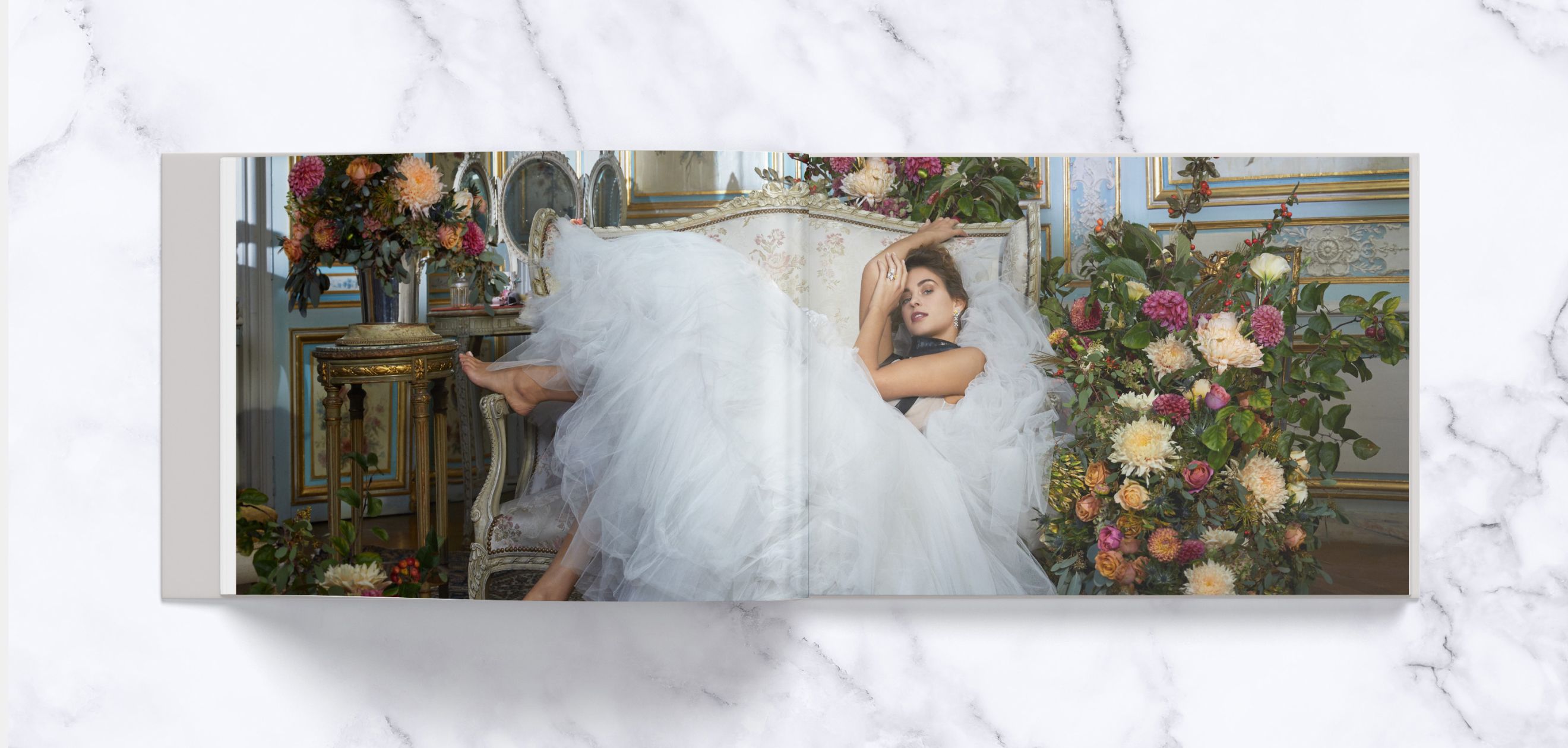
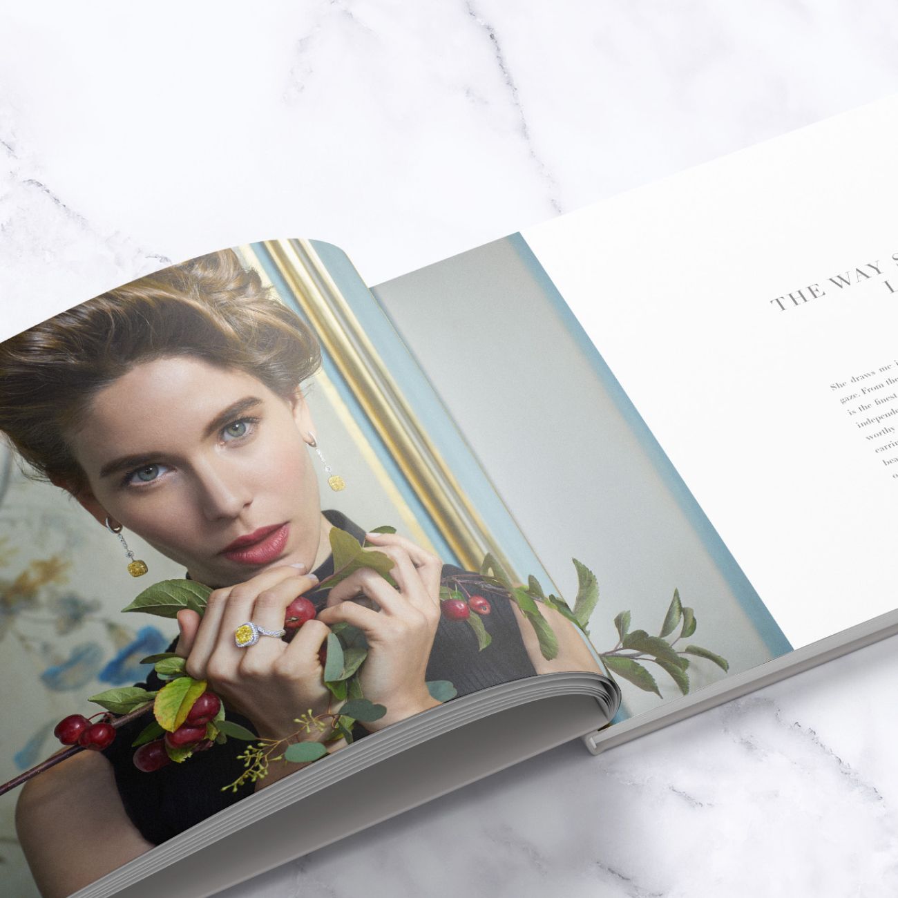
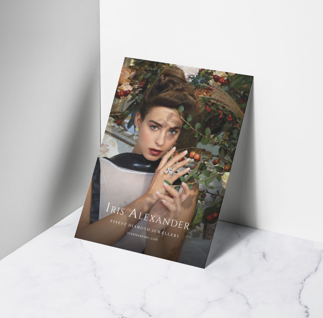
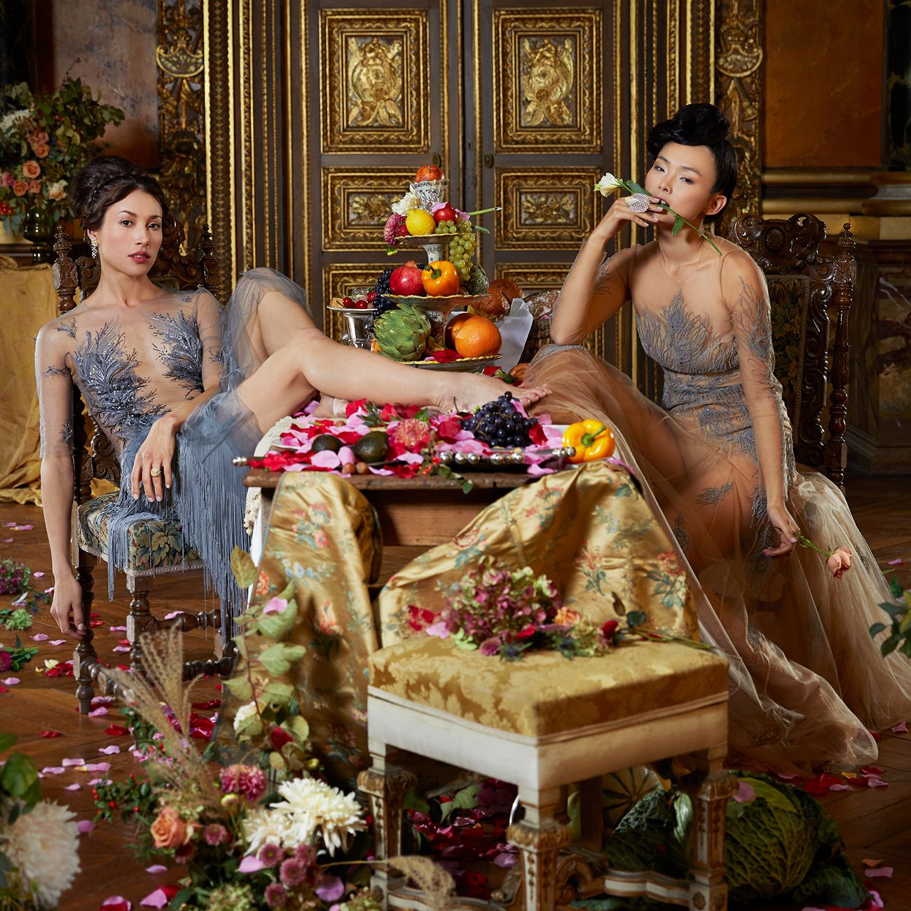
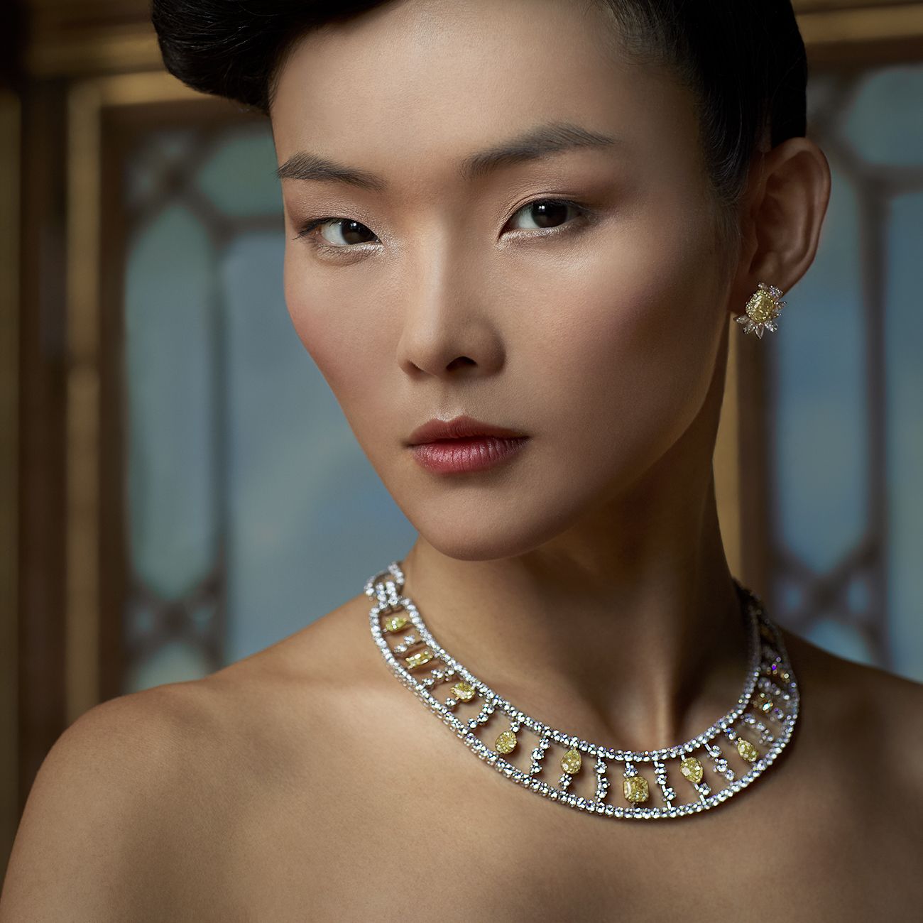
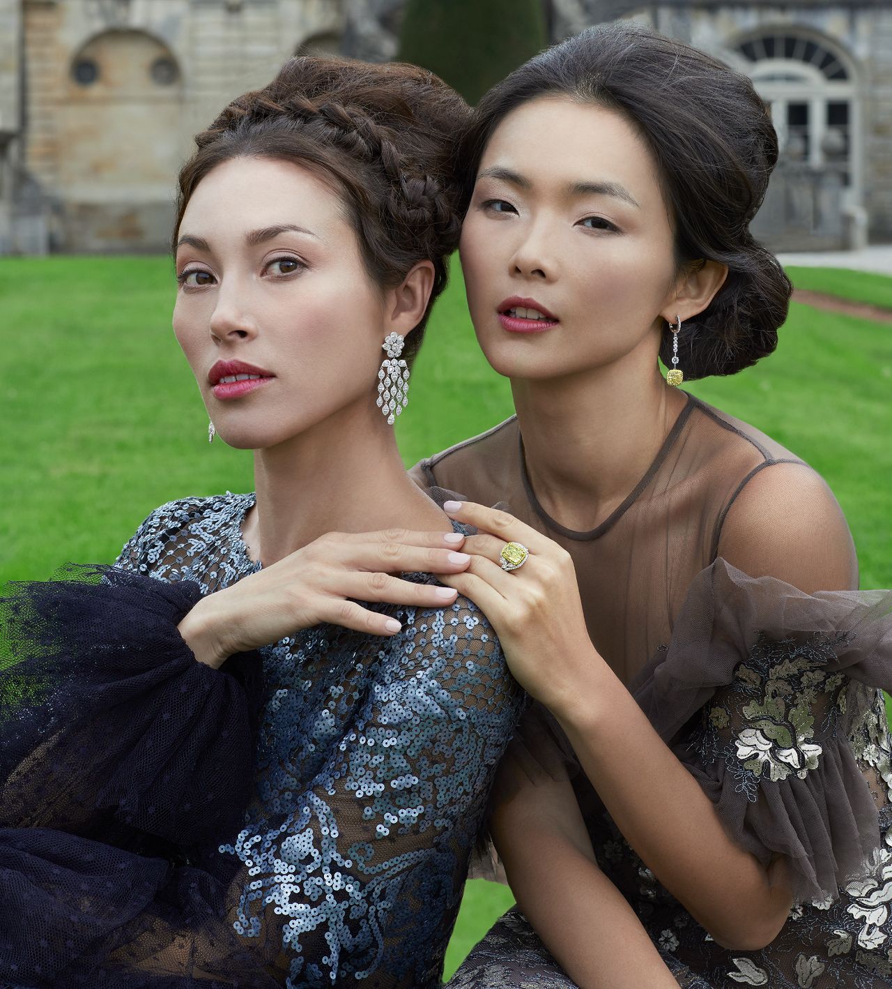
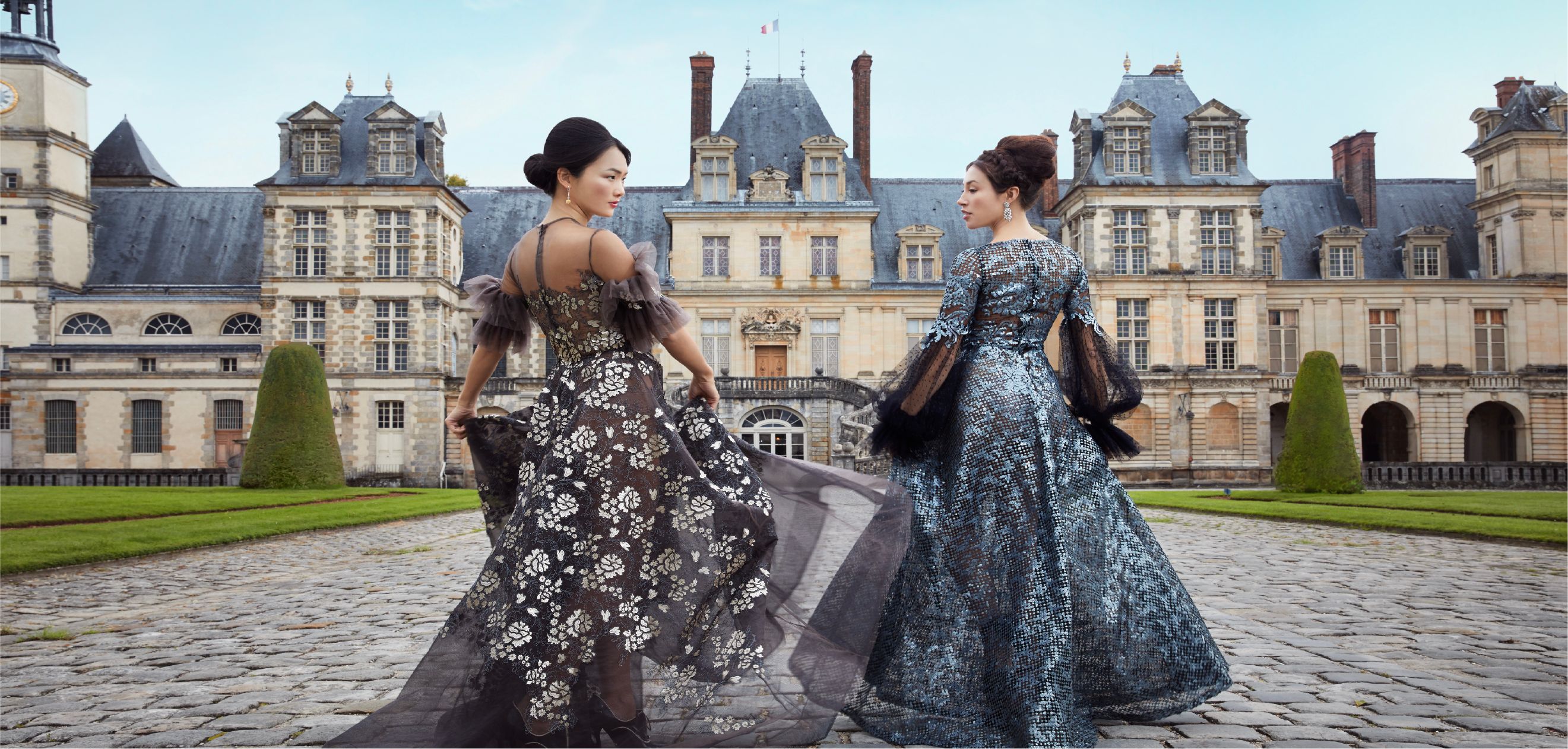
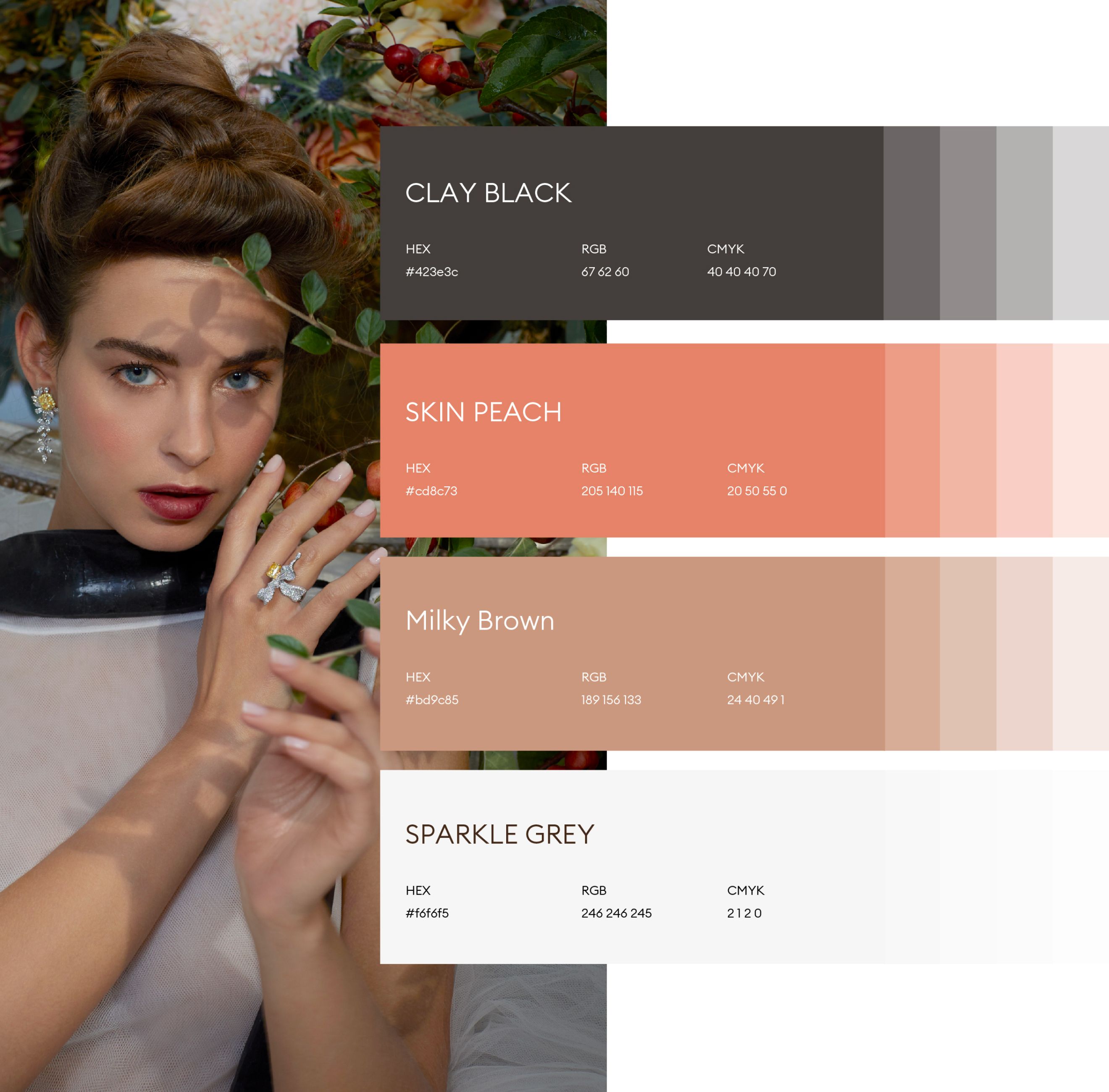
Iris Alexander is a fine jewelry house in Hong Kong where Renaissance heritage and Baroque splendor collide with the unapologetic power of the modern woman. We developed the brand strategy and identity to reflect a world where craftsmanship becomes a language of control, elegance, and audacity. Inspired by the Château de Fontainebleau, the art direction draws from rose gold, silver, deep black, and rich textures to evoke regal intensity. Imagery is bold and commanding, portraying women not as muses, but as sovereign forces.
The verbal identity uses intimate yet authoritative language, turning each phrase into a declaration of identity. Across digital, print, and campaign touchpoints, Iris Alexander emerges as a modern Renaissance — one where beauty is strength, and ornament becomes a symbol of self-possession, purpose, and rule.
TYPOGRAPHY


FONTS GUIDE
HEADING
Sub-heading
RaleWay introduces a contemporary voice—clean, poised, and modern. It balances the ornate with the minimal, offering a confident counterpoint that reflects the brand’s duality.
Body copy flows with ease and clarity, supported by expressive details like Dulcinea for signature applications and intimate accents. The typographic system reflects Iris Alexander’s core: where femininity is strength, beauty is bold, and every word carries intention.