Client
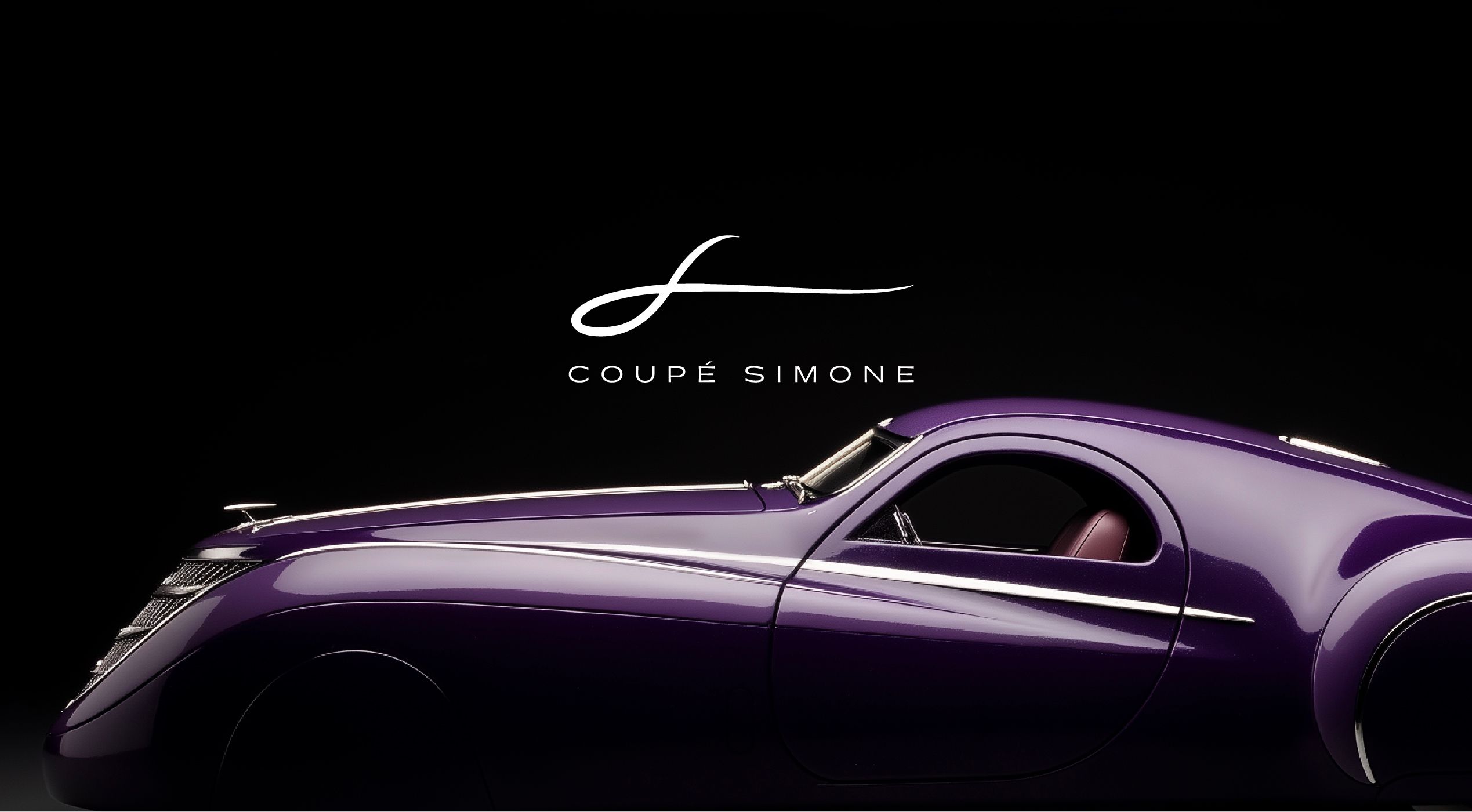
Coupé Simone
SERVICES
Art Direction | Brand Development | Brand Identity | Microsite | Coffee Table Book
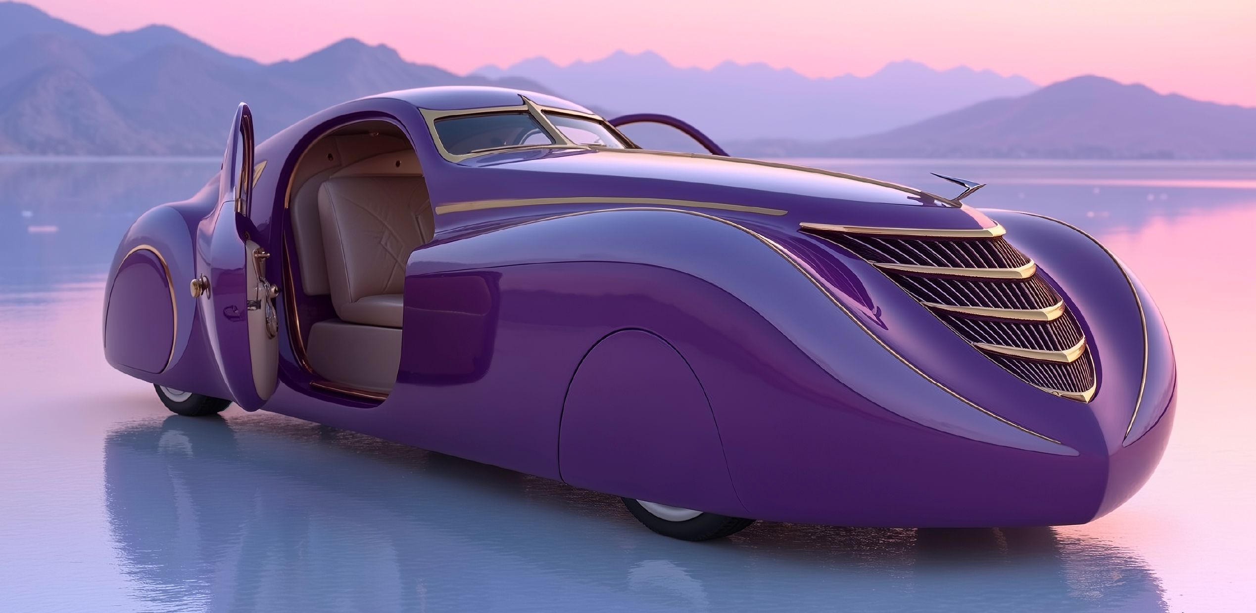
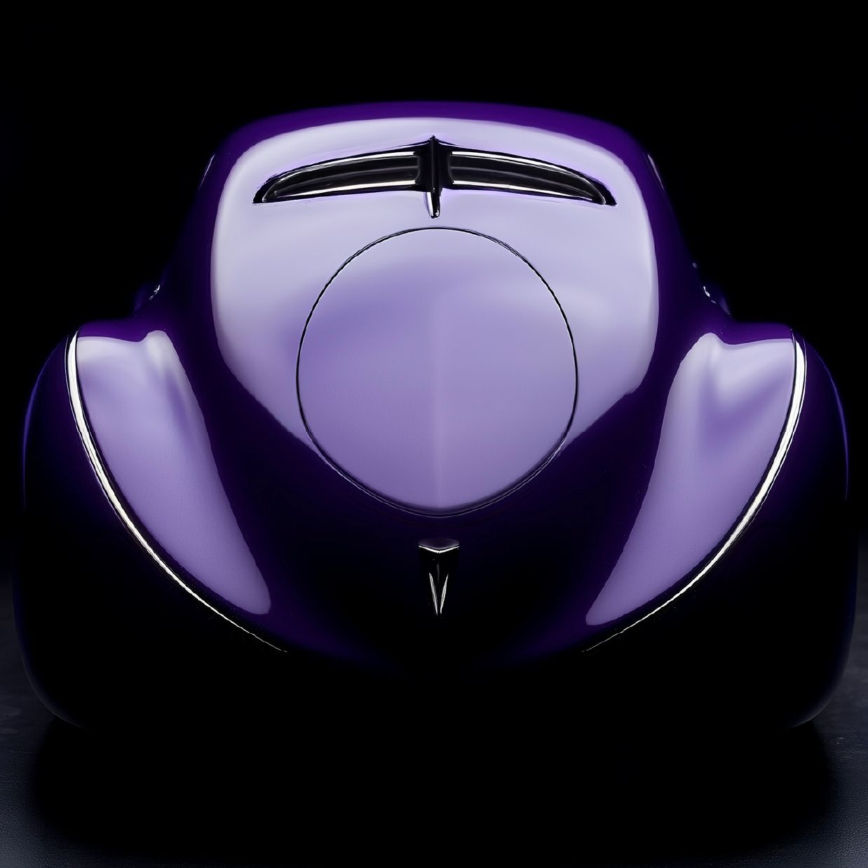
Coupé Simone is a one-of-a-kind automotive revival project where Art Deco futurism meets
modern craftsmanship. More than a car, it is a design statement and a living work of art,
born to inspire and built to leave a lasting legacy.

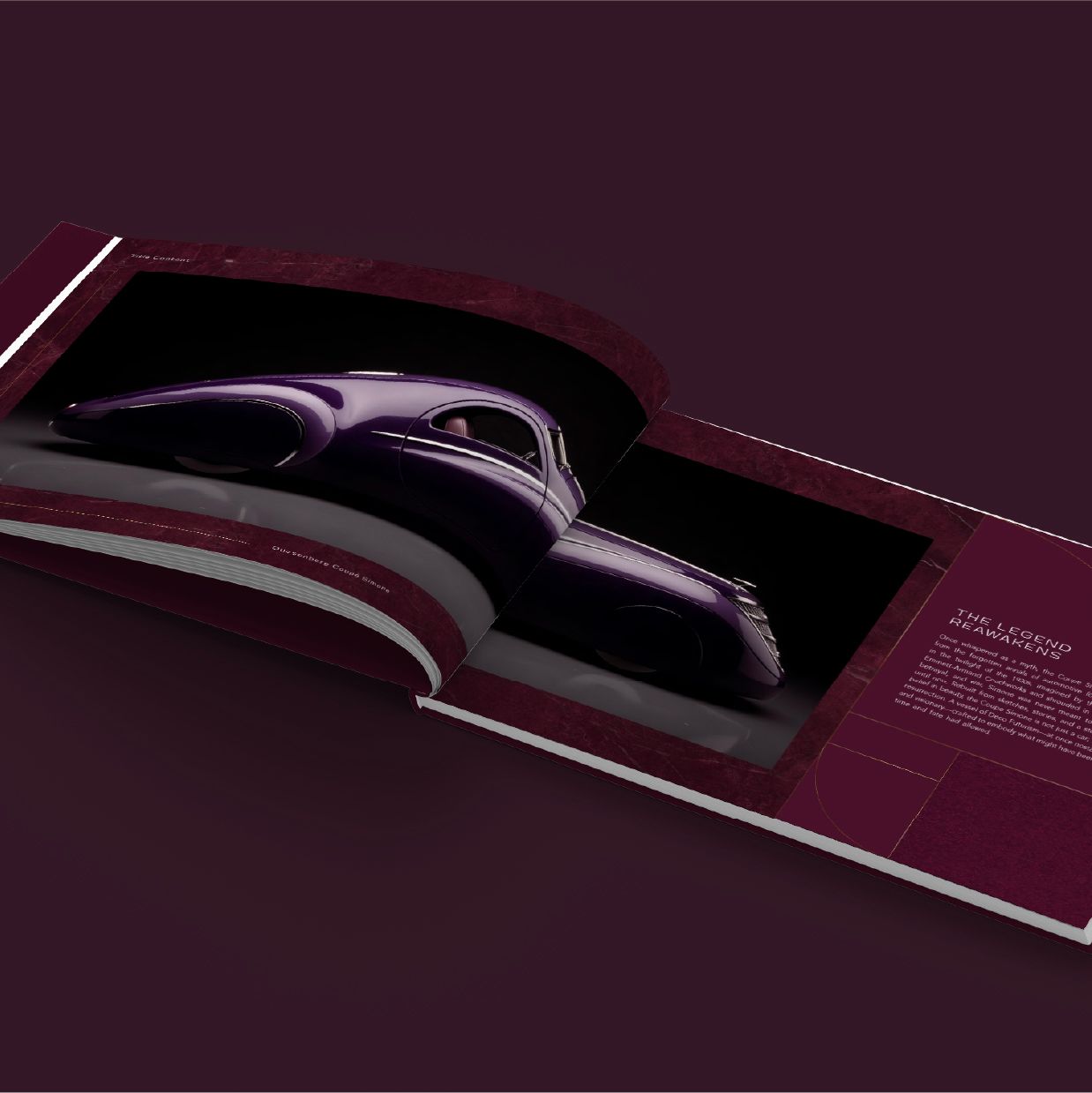
A MASTERPIECE REBORN THROUGH DESIGN and
VISION, CRAFTING THE IDENTITY OF A CAR that
LIVES BEYOND TIME
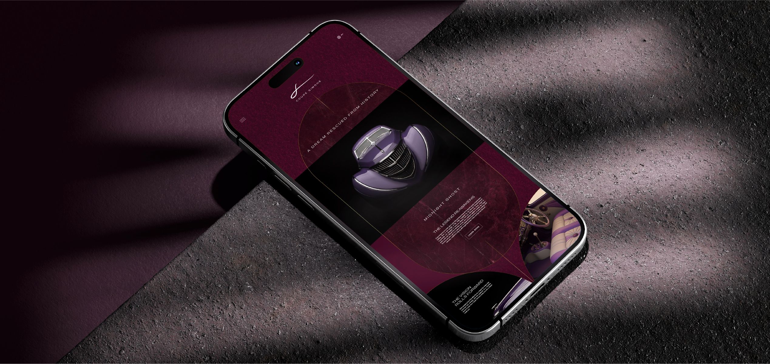
Coupé Simone is more than a car. It is a resurrection of design and emotion, brought to life through
elegance, mystery, and cultural depth. We crafted the complete brand universe, from naming and
brand pillars to a cinematic microsite and a limited-edition coffee table book. The identity draws
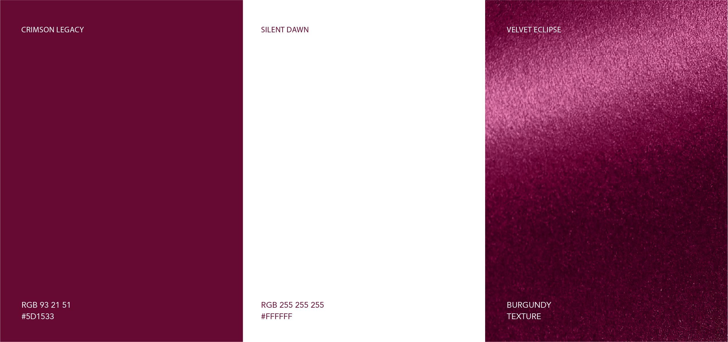
on Deco futurism and visionary craftsmanship, with a palette of midnight purples and moonlit
silvers that evoke sophistication and intrigue.
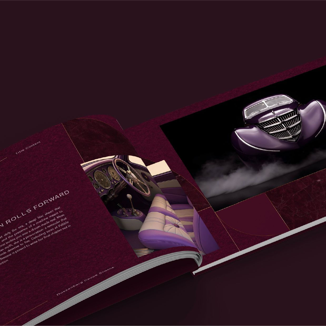
Typography and color express emotion with restraint, reinforcing the car’s sculptural beauty. Every
touchpoint was designed to feel timeless and tactile. The coffee table book captures the story as
both artifact and expression. Coupé Simone exists not only as an automobile but as a living symbol
of legacy, imagination, and creative power.
TYPOGRAPHY


FONT GUIDE
HEADING
Sub-heading
The Coupé Simone typography system harmonizes the bold elegance of PP Gatwick with the timeless clarity of Avenir, creating a visual language that feels both iconic and contemporary. PP Gatwick introduces a sculptural strength and architectural presence, channeling the dramatic flair of Deco futurism, while Avenir grounds the system with balanced geometry and effortless readability. Together, they establish a dialogue between expressive personality and functional refinement.