Client
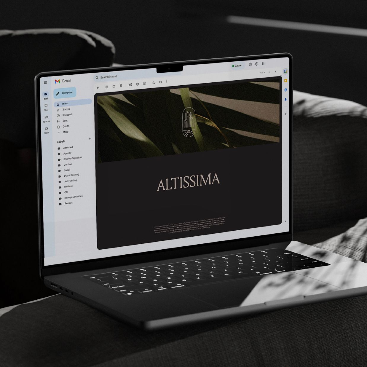
Altissima
SERVICES
Brand Strategy | Brand Identity | Branding Touchpoints
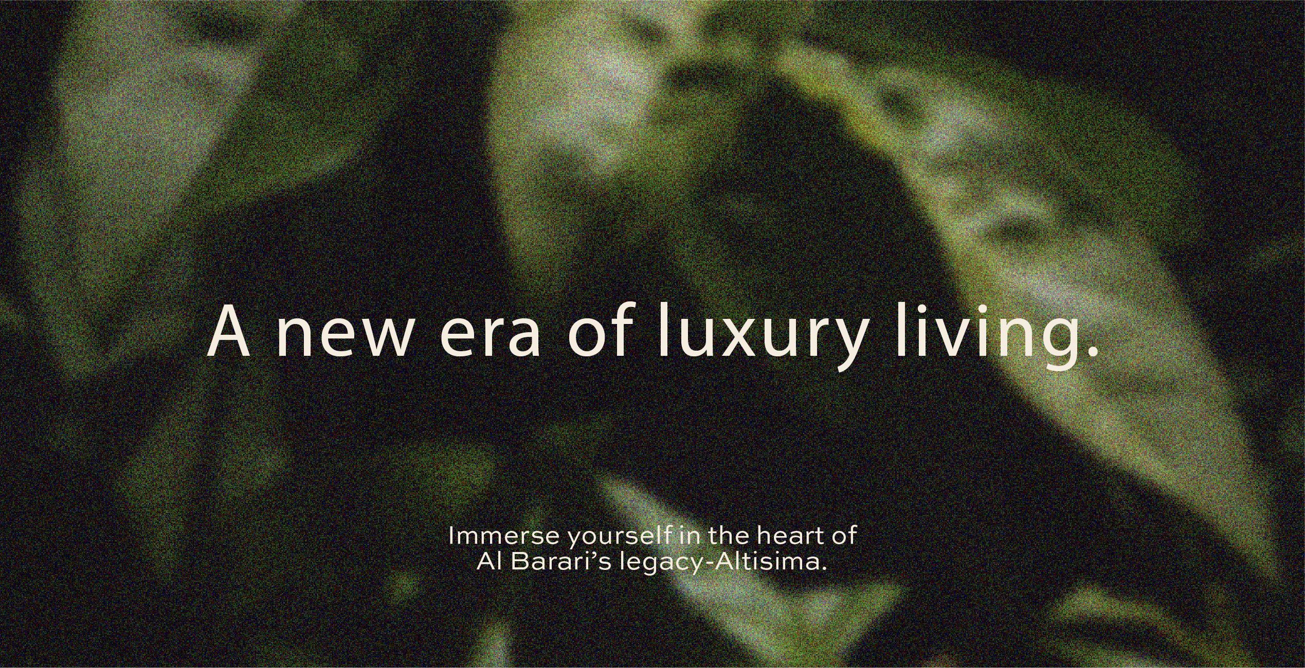
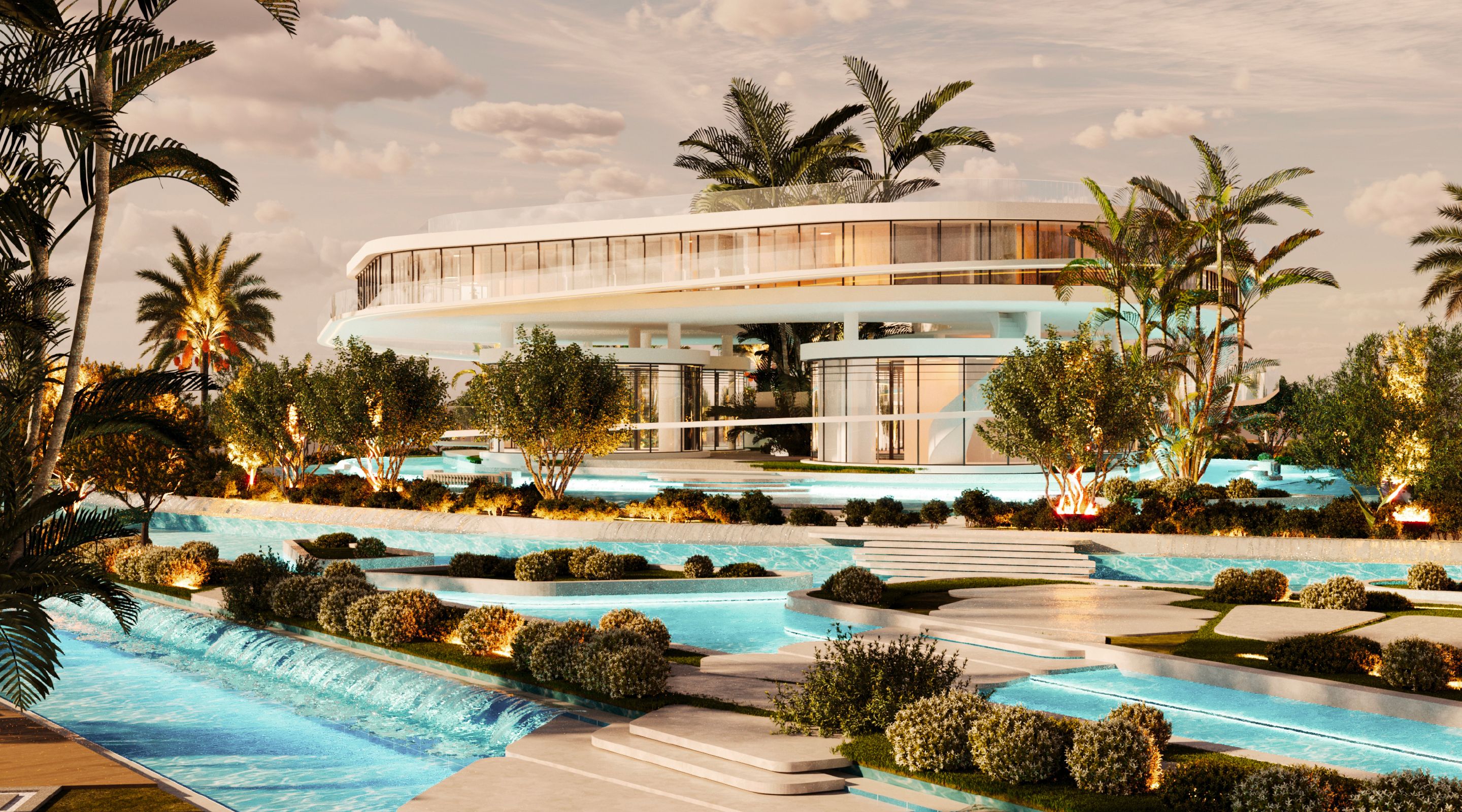
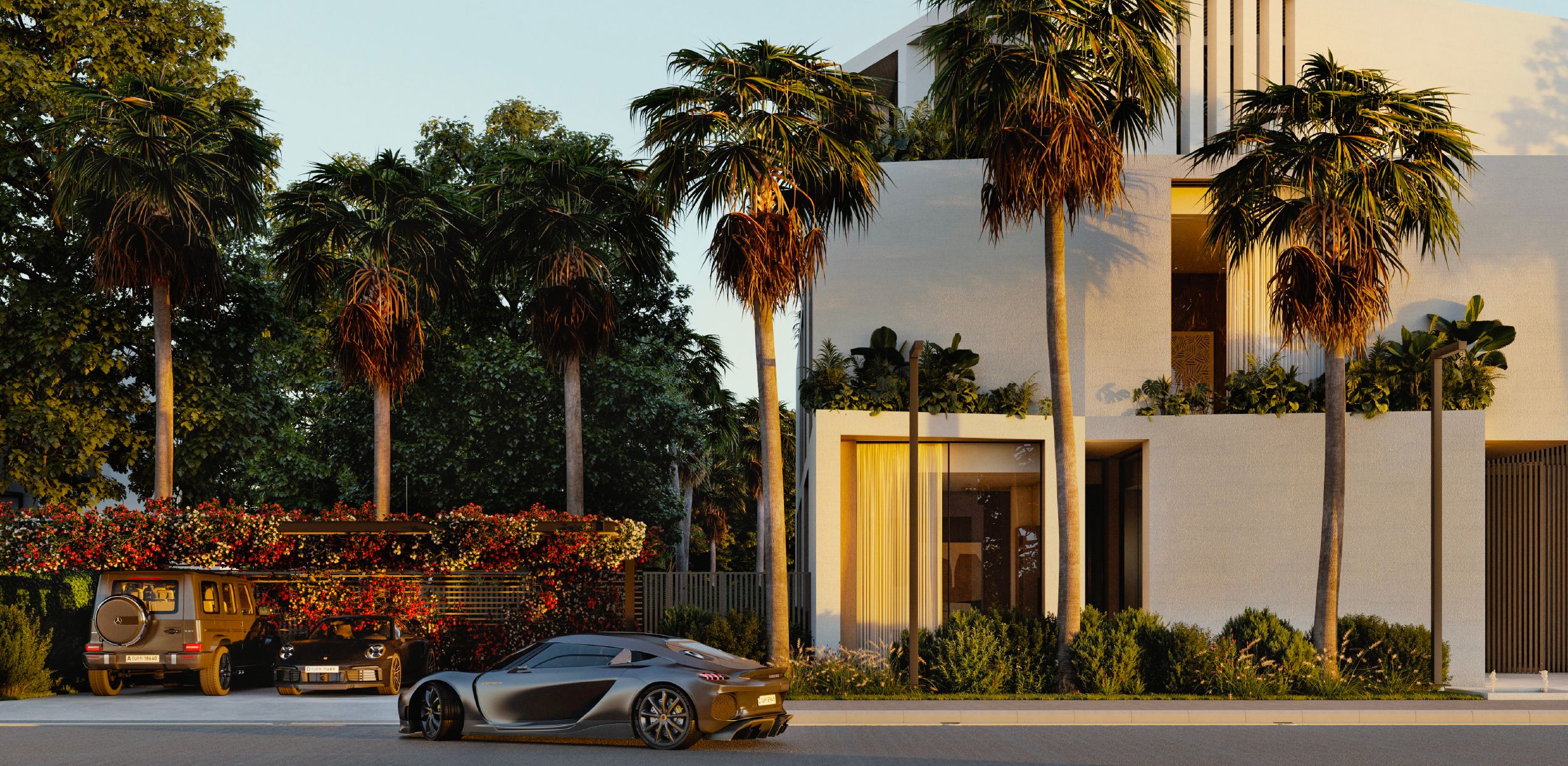
Cradled in the verdant embrace of Al Barari, Altissima offers a quiet rhythm of life shaped by
nature’s calm and architecture’s grace. Here, flow meets stillness, and every space becomes
a meditation in light, texture, and intentional beauty.
As a luxury lifestyle and experiential travel company, The Fixer required a brand strategy
and identity that capture the art of orchestrating unforgettable moments for HNWIs and
UHNWIs worldwide.
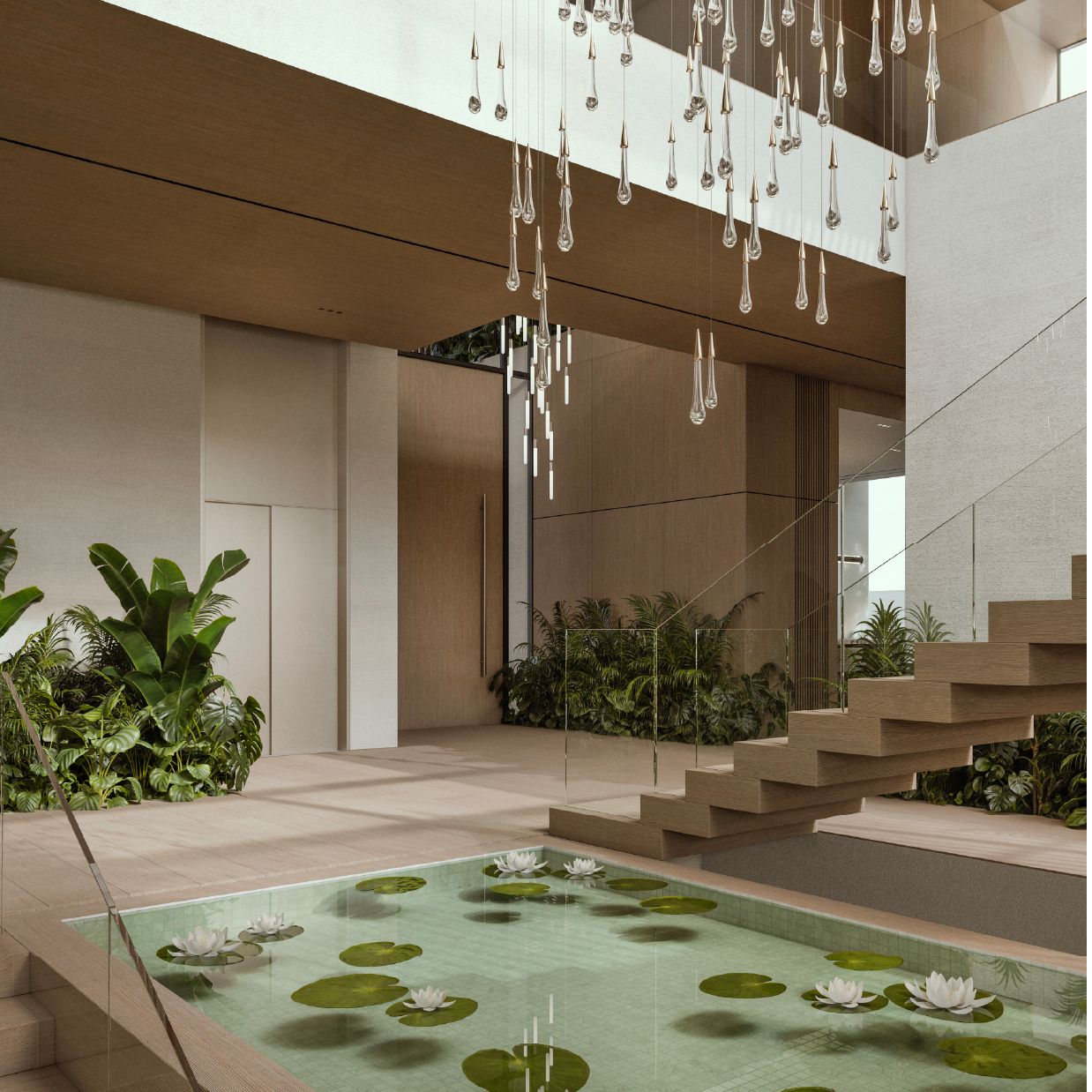
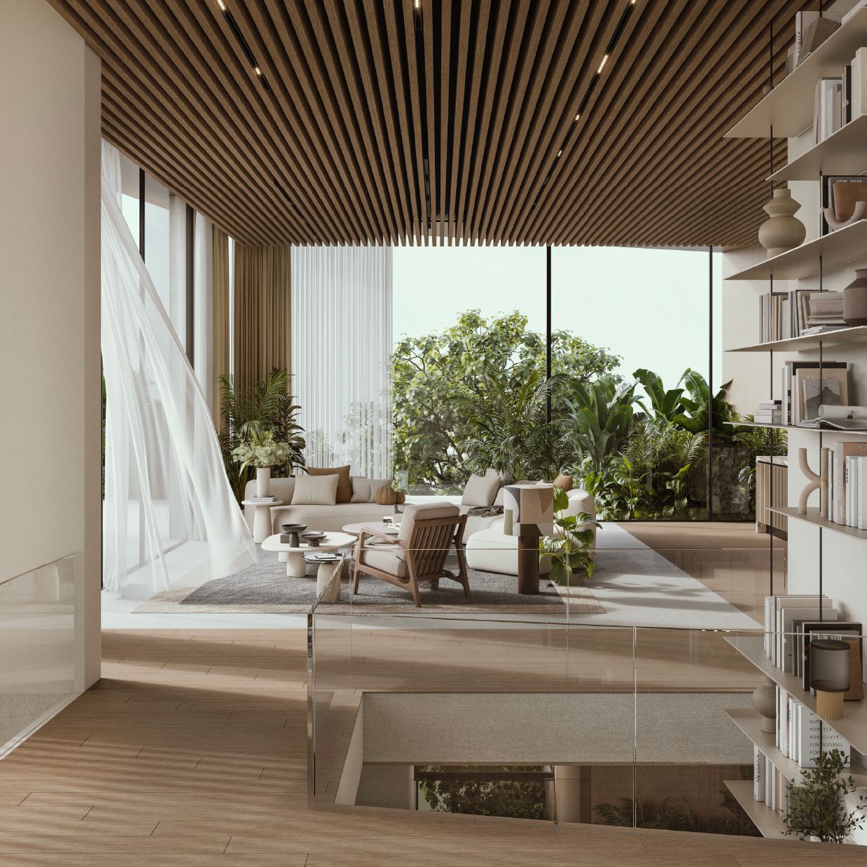
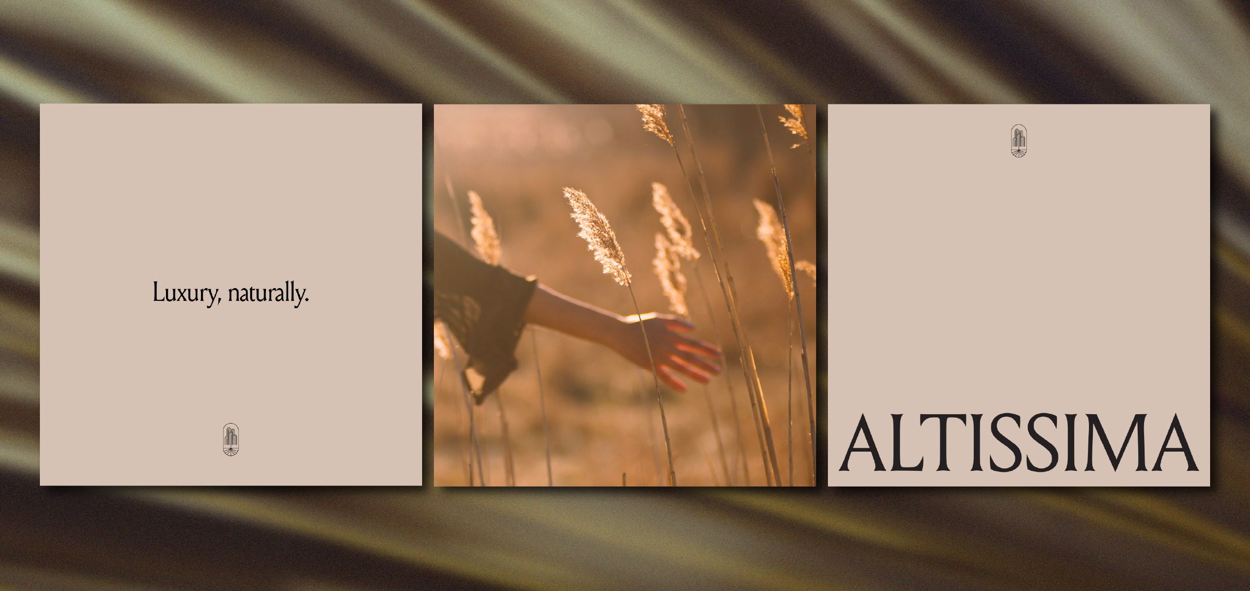
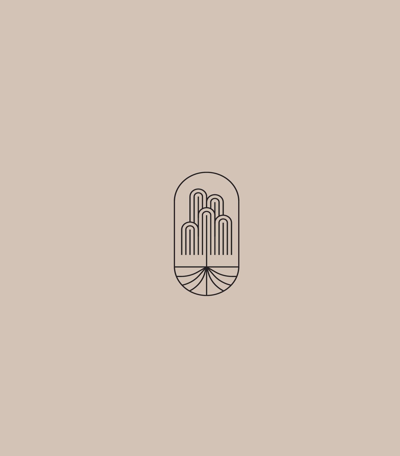
COMPOSING A WORLD of NATURAL ELEGANCE
Altissima is a visual and strategic expression of refined living shaped by Al Barari’s natural
context and architectural depth. We developed a brand identity that conveys clarity, restraint,
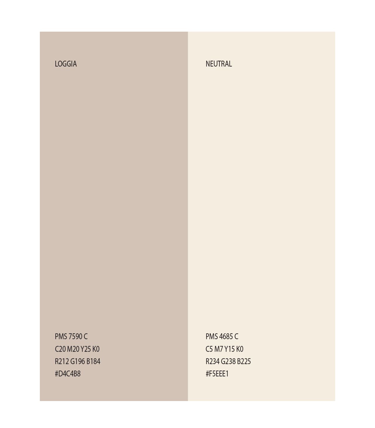
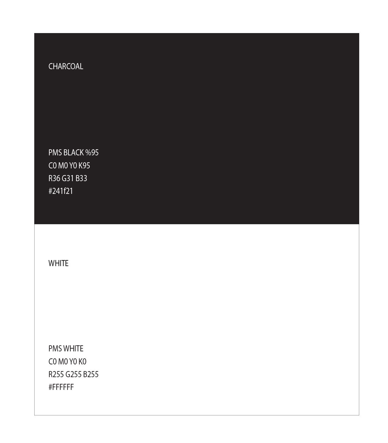
and confidence without excess. The colour palette — soft whites, nuanced charcoals, and warm
metallics — mirrors the environment’s serene tones, while the typographic system balances
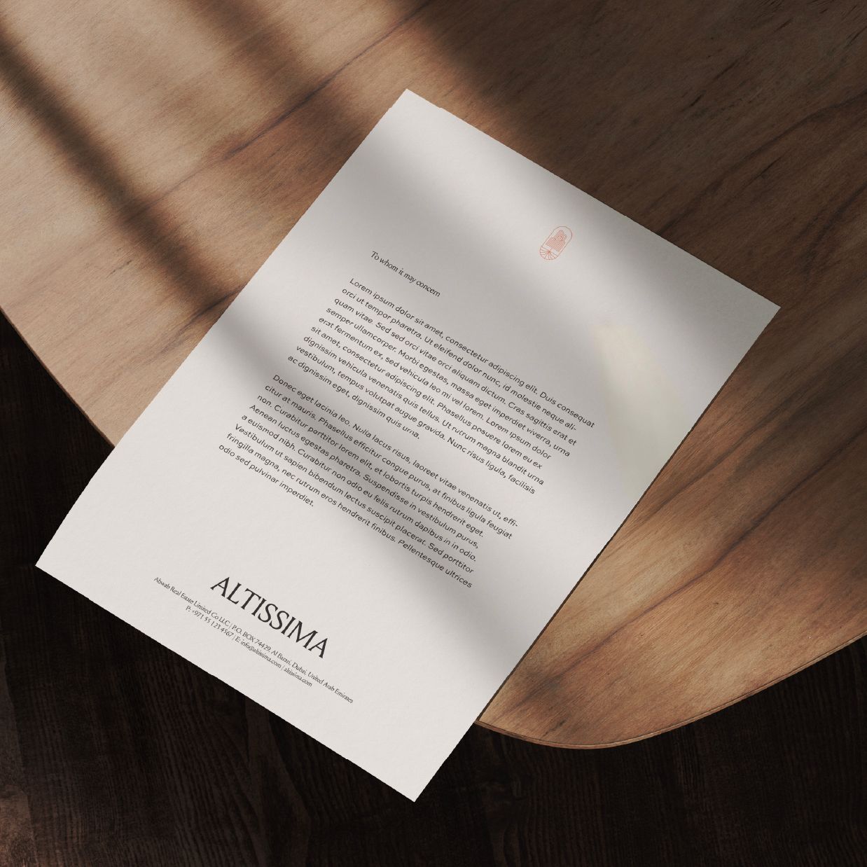
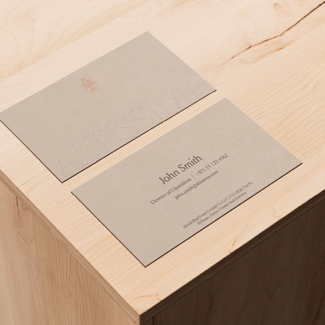
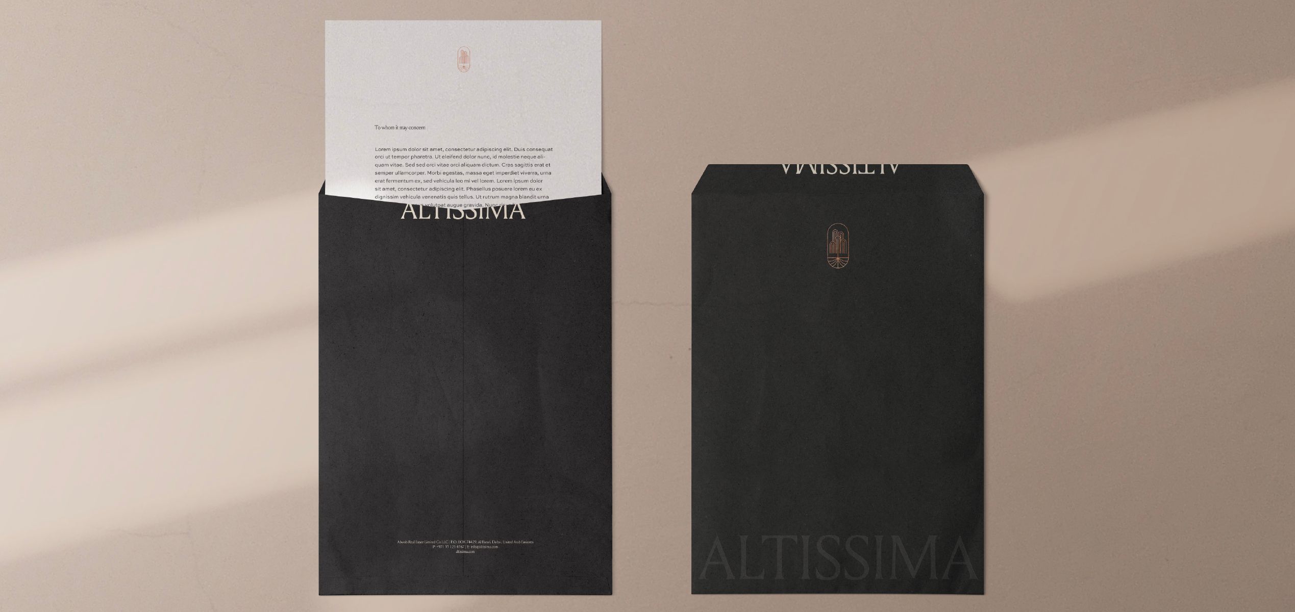
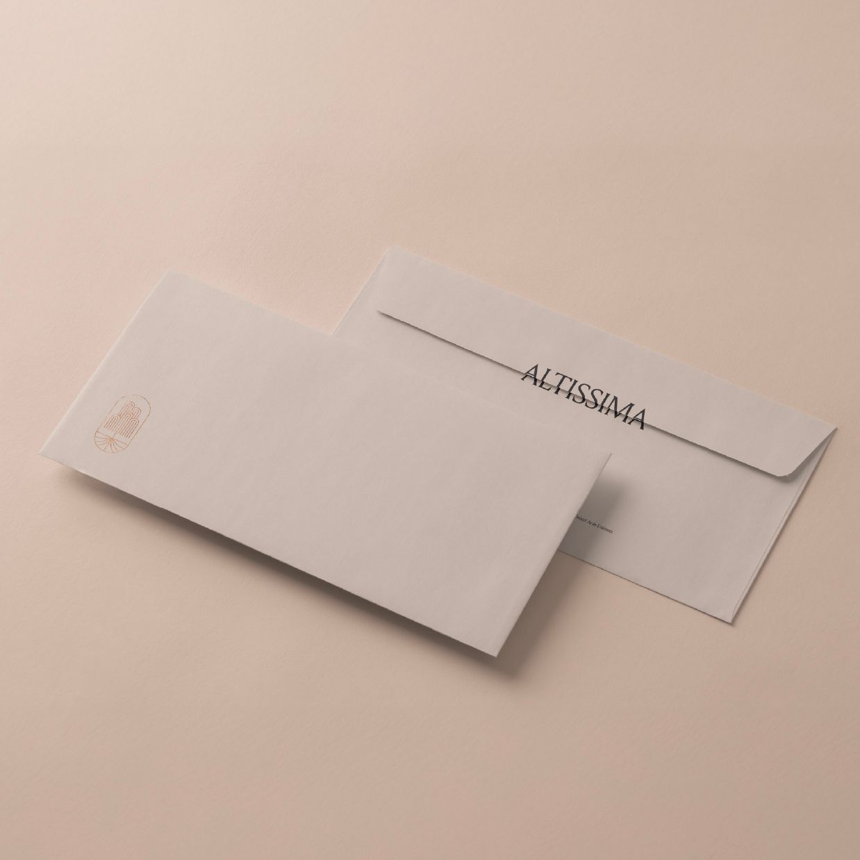
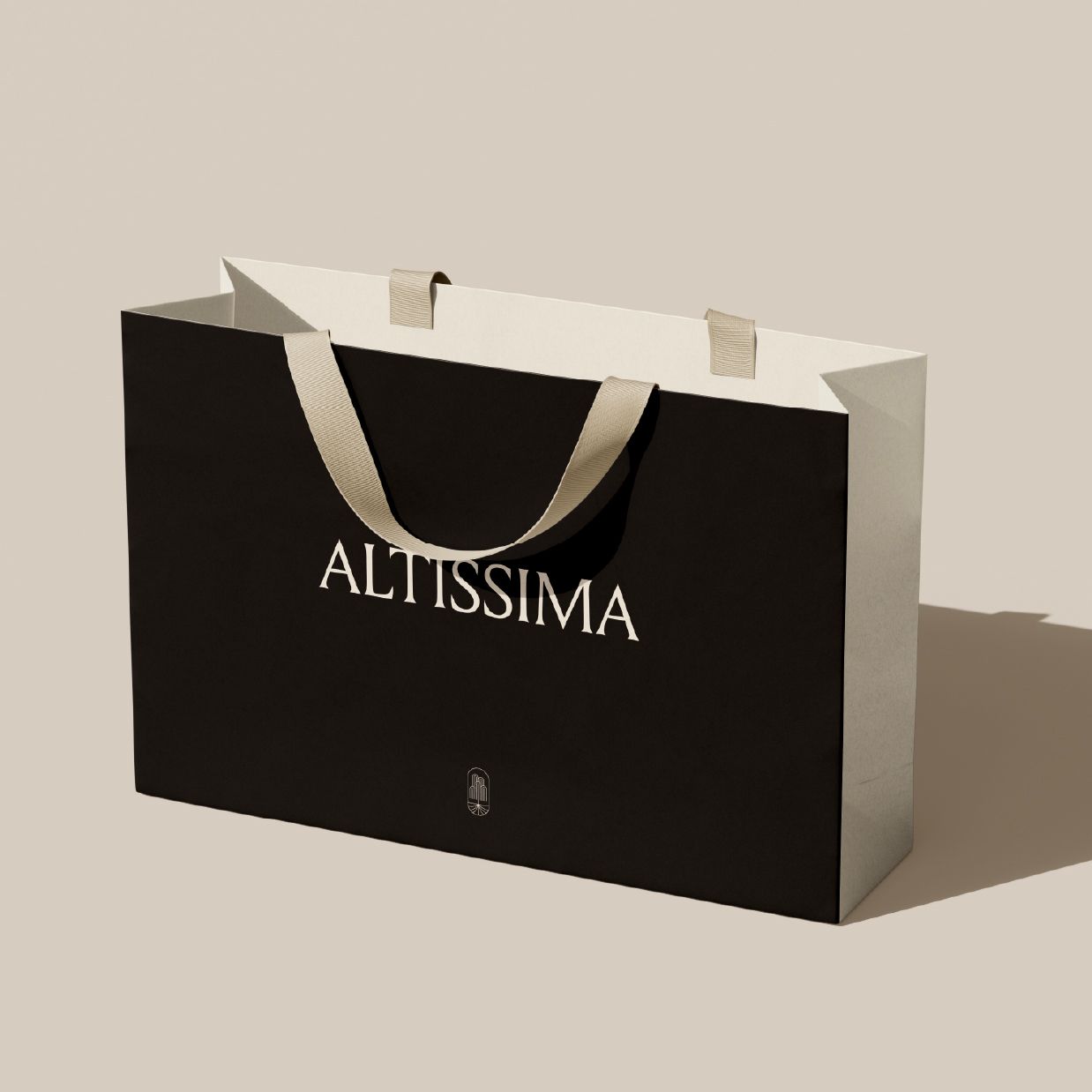
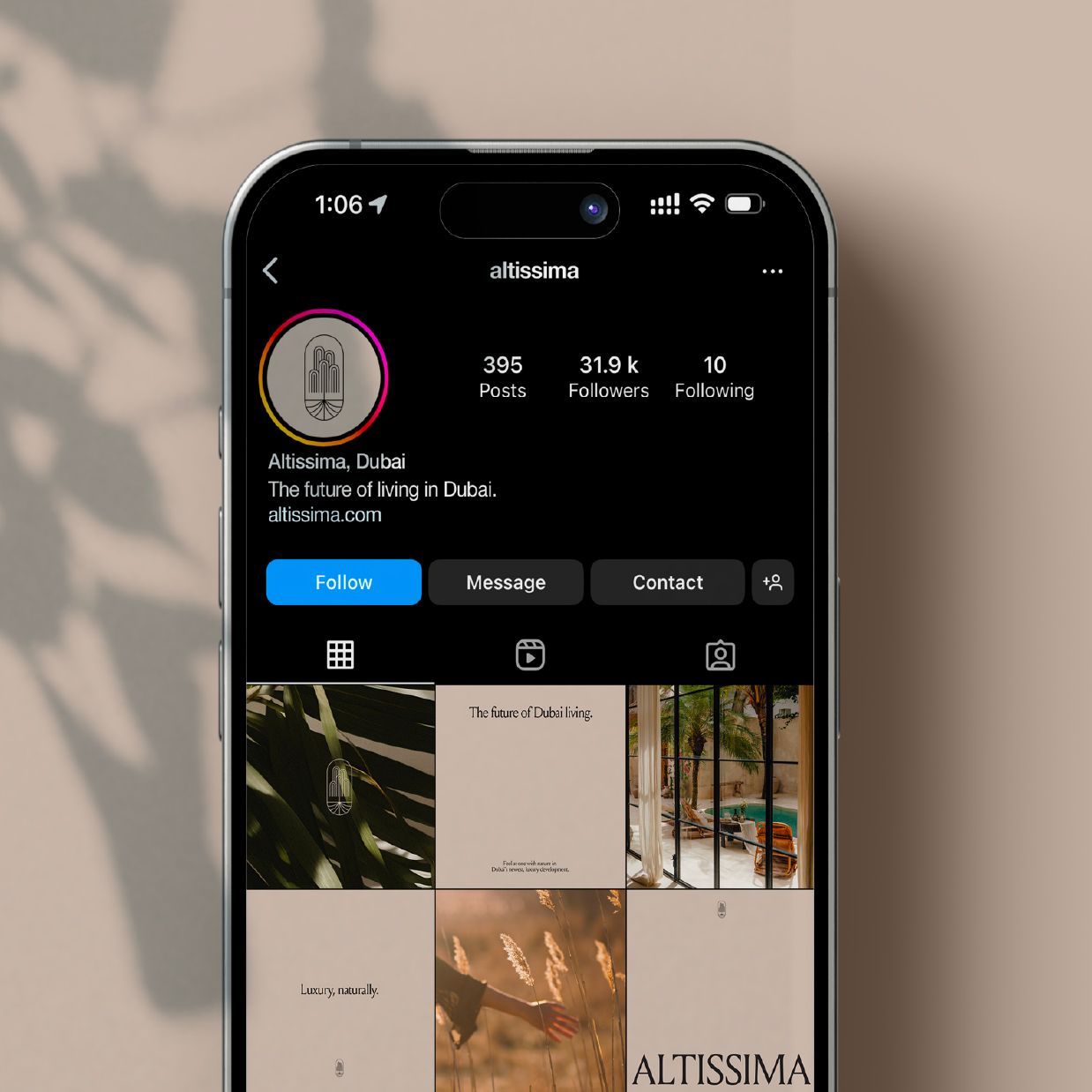
classical elegance with contemporary fluidity. Every application, from tactile print materials
to digital environments, was designed with coherence and care. What emerges is a brand that feels
elevated yet grounded, subtle yet unforgettable. More than a residential project, Altissima offers
a refined rhythm of living — where the essence of home becomes a reflection of nature, space, and
inner stillness.
TYPOGRAPHY


FONTS GUIDE
HEADING
Sub-heading
Altissima’s voice begins with Louize Display a serif typeface chosen for its sculptural beauty and timeless restraint. Used for titles and key statements, it brings architectural elegance and quiet authority to the brand’s visual language.
Subheadings maintain clarity and refinement through Sweet Sans Pro. Its soft geometry introduces contrast without tension, guiding the reader through content with understated ease.
This typographic pairing reflects the balance at the heart of Altissima — where structure meets fluidity, and every detail is designed to serve both form and feeling. Whether in print or digital, the typography supports a lifestyle rooted in stillness, sophistication, and natural grace.